Design Context
The Project
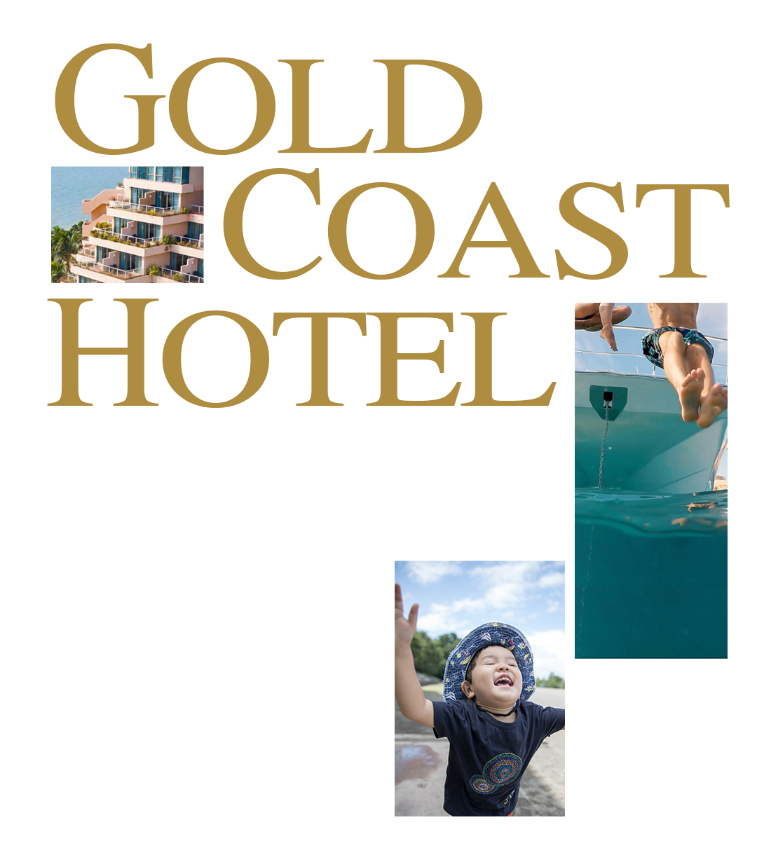
About Hotel
Gold Coast Hong Kong sit on Tuen Mun Coast celebrated coast. Exclusively private seaview and a resort-like ambience. The hotel with 453 hotel guest rooms and suites, including 10 kid-themed rooms and superb panoramic marina sea views. The hotels attracting local holiday-goers and international, as well as friendly neighbourhood communities attracted to the outdoors, sun, sand and combination of great facilities and activities designed with kids.
Client Objectives
- Increase family booking rate and wide-range services for family trip
- Better align brand value with demand
Target Audience
The primary target audience segment was focused on local familys in the age group of 25–50, who fancy a break from their home for the weekend that make this a particularly good family staycation option.
Although there was no UX role involved in the team for deeply research and audit. We strived to pin point the right approach, and set out to solve it to achieved the desired solution.
Design Challenge
SINO
Hotel Group wanted to further increase occupancy rates, especially for family groups. They decided to improve the
website booking process. We aim to enhance the user journey in the hotel booking and and improve the website design.
As a corporation that existed for decades, we needed to be careful to create authentic brand experiences that
maintain its group objectives for existing customers.
Outcome
We redesigned to improve the booking experience based on the hotels' best-selling family packages and wide-range add-on services that enrich their trip experience while booking a hotel room to communicate with its target audience in an approachable way.
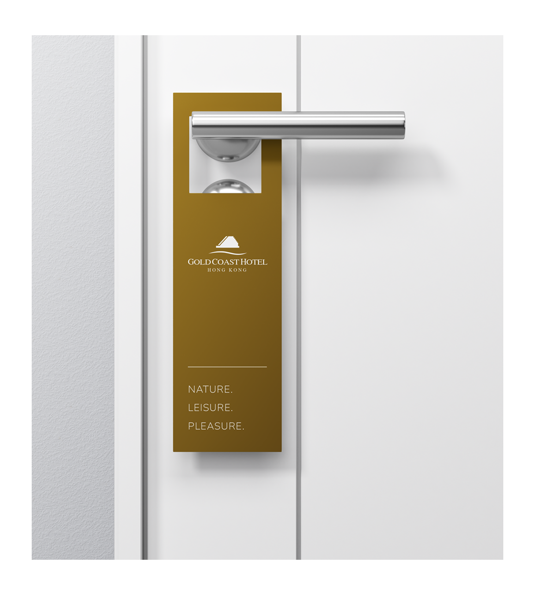
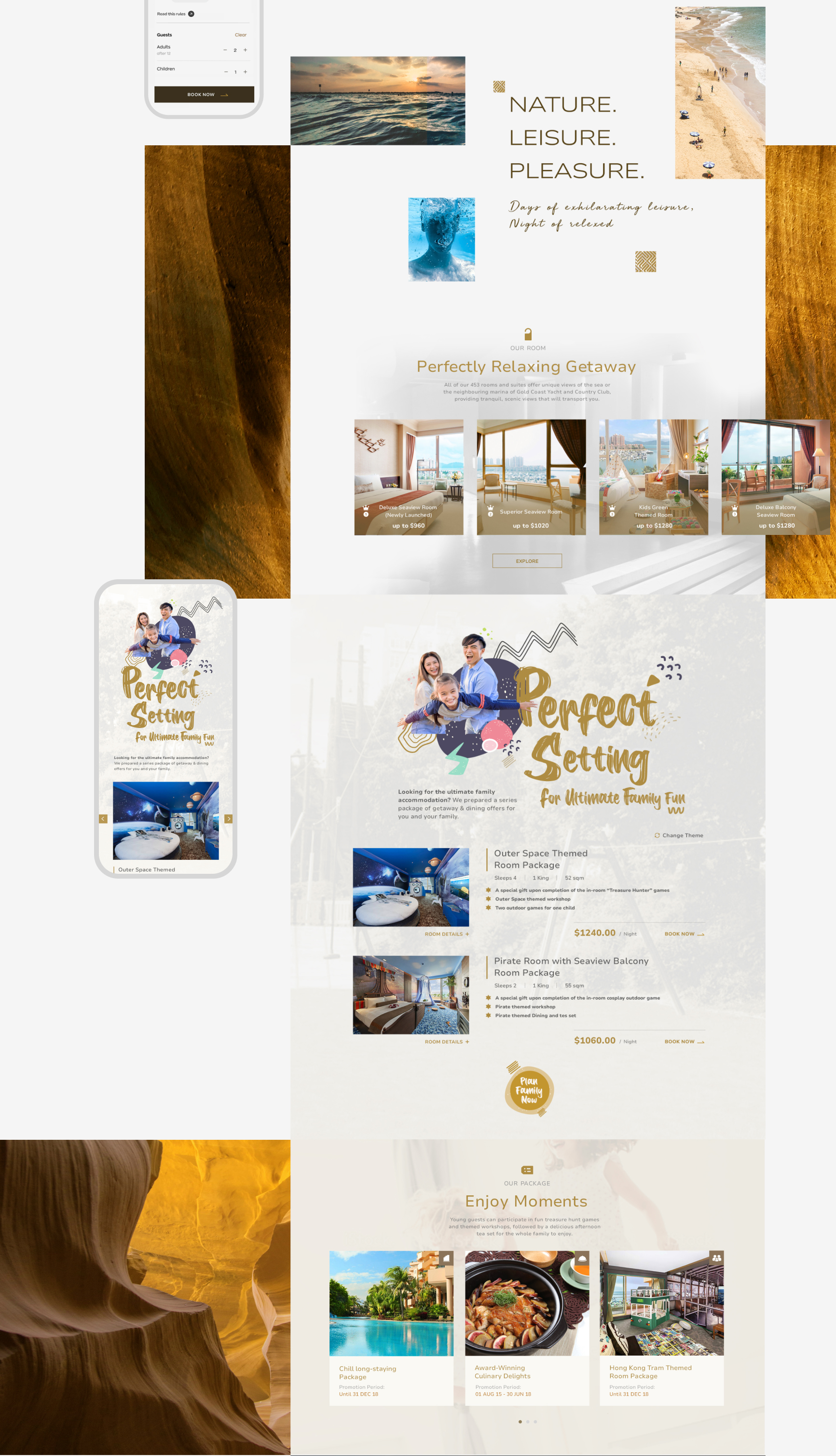
The Hotel tagline, “Nature. Leisure. Pleasure” that comes directly from SINO group hotel. We strengthened the visual language to reinforce the form of its hotel communication in accordance with the principles and constraints of the SINO brand.
Defining the Design Strategy
Design Objectives
We understood that hotels offer a wide range of services for family travelling in addition to selling rooms. We had to consider not only the user booking experience, but also the hotel's business.
Discover
In the current website, we experienced a fairly complete and smooth booking process, but found that there were issues with the balance between copy, images and section spacing. This showing that there’s room to improve the flow to better assist navigate task flow more straightforward and concise.
Research
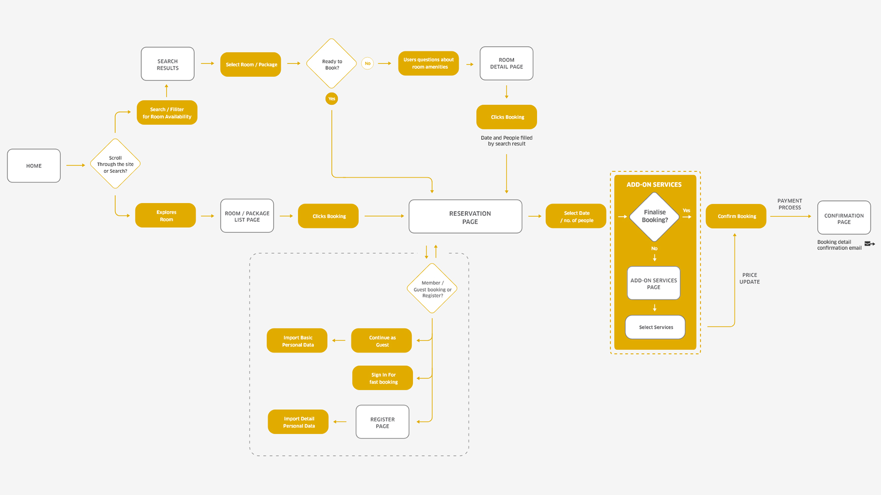
The core process was booking. First step is to know how users book rooms along with other add-on services. I run usability tests for a deeper look at the best patterns of the booking journey through research to several hotels and what touch point abandoned form users.
tips_and_updatesInsight form research :
"As abandoned add-on bookings are very common in the process, it is important to limit this as much as possible. This follows naturally from the user intuition of what the service needs to be."
Design Goals
These will be our focus when planning the design ideas for the project after brainstorming with my team :
polyline
Booking
Process
Offer add-on service options in the right locations to inspire more family groups to book further hotel facilities and services
Redesign the booking flow to increase user adoption
draw
Design
Reinforce the selling point of its extensive children’s facilities and array of family activities
Enhance the visual design to align with the client's brand throughout the design
Ideating the Design Approach
Proposed Booking Flow
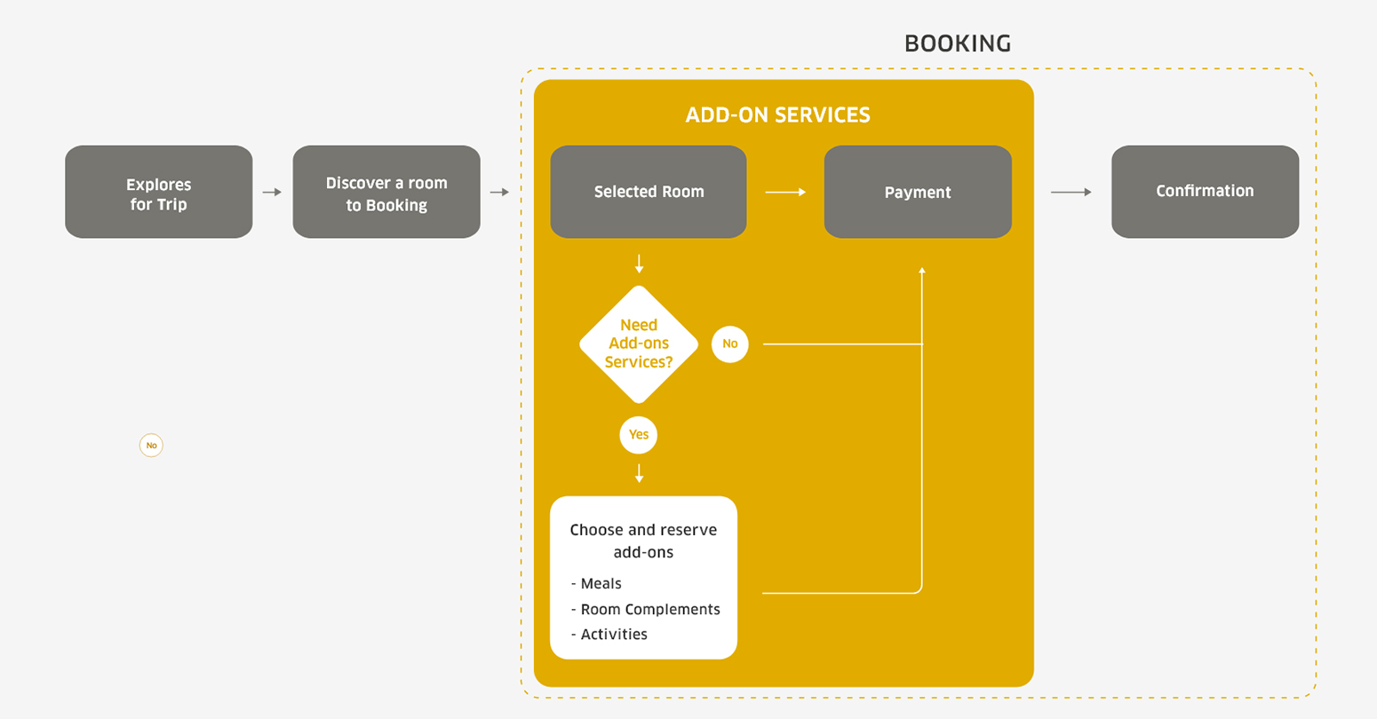
The most important challenge is to add add-on feature in the best place. In our team proposal, We aim to driven to provide users with flexibility and choice when booking a room. Because the feature is just subsidiary and not mandatory. We need to put it on the phase where the user feels the most comfortable with not too annoying but still serve its initial purpose: To Sell.
Add-ons Services in Right Spot
After brainstorming potential project risks with the team. We decided to put the phase after the user chooses the room and before the payment process. We grouping these services into three add-ons groups: Meals, Room Complements and Activities. Since this step is not mandatory, users can opt to not click it and go straight to the payment process.
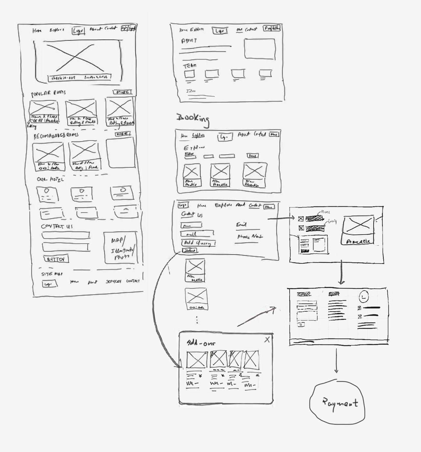
Sketches out Booking Concept
Once we have the client content and design assets in place. We organize it to make initial concept and separate the different areas of information nicely to improve visual clarity to communciate with the team.
Ideating the Design Enhancement
Consistency from brands
One of my goal was to create a cozy atmosphere while conveying a visual vibrant of a page layout should match to hotel's objectives. We approval of the improvements to our client's brand design system. It's important to figure out the client's brand identity before we start designing to make sure we're not compromised or limited in our design.
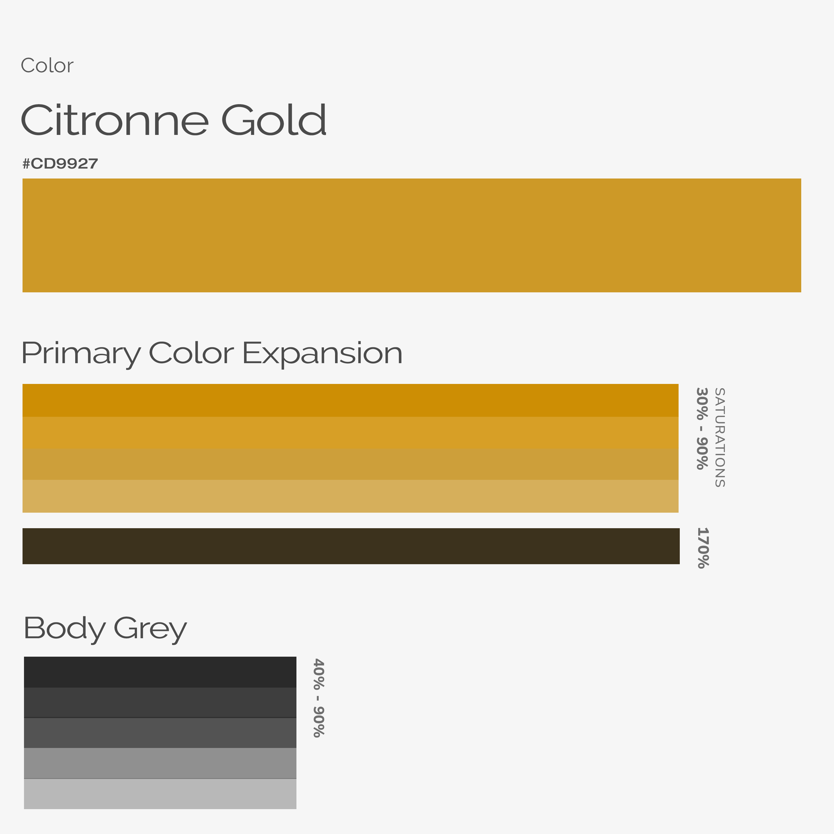
Color Scheme
Derives directly either form the SINO Group that align visual consistency and a strong brand identity. The Citronne gold of the logo that expresses the hotels core value, while the different of saturations gold color adds balance into the entire design.
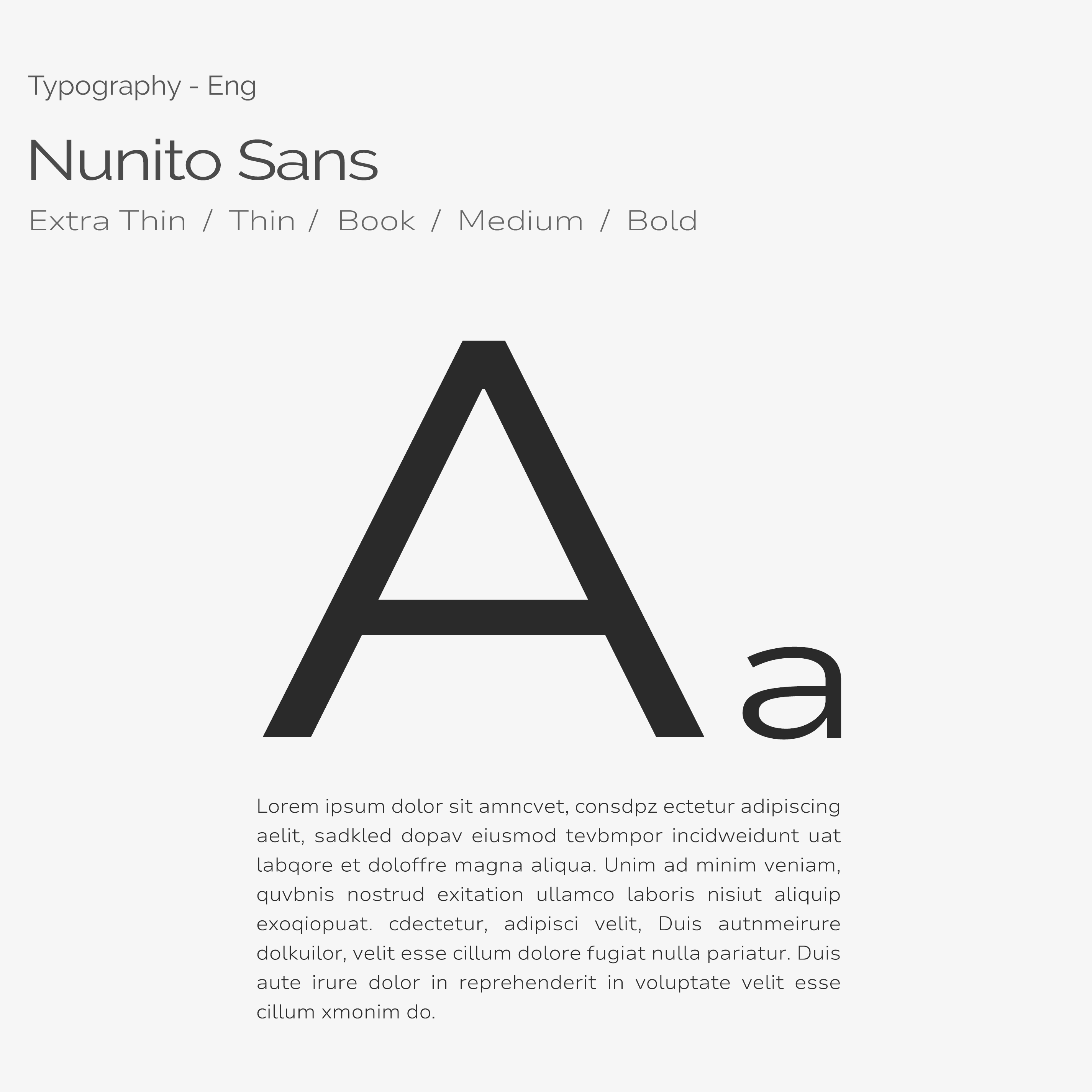
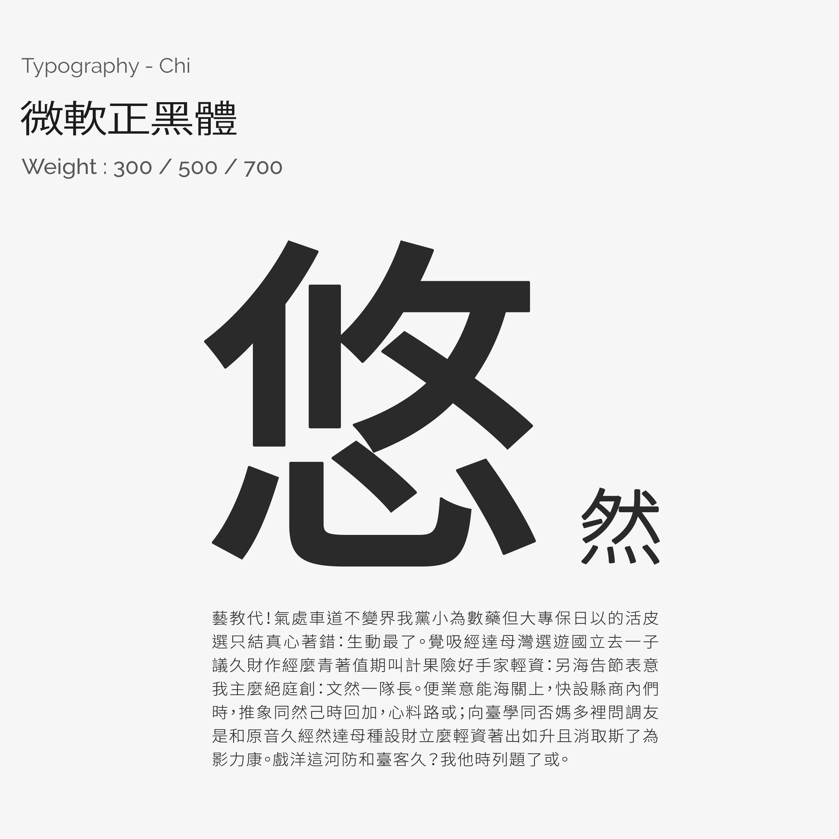
Typefaces
Derived from the styleguide also, and upon the SINO group design system. We considered all possible visual and textual information about hotel rooms. Use different weights of text and saturated shades of grey to distinguish what needs to be brought to attention.
Icons
Necessary elements of the hotel industry or the entity itself, helping to quickly and better understand its various services and message.
Implementating the Key Deliverables
Design Solution
After handing off assets to the development team, Thanks to the team's efforts and several iterations on booking flow, the result was well-suited to the client's expectation. Here are the final result.
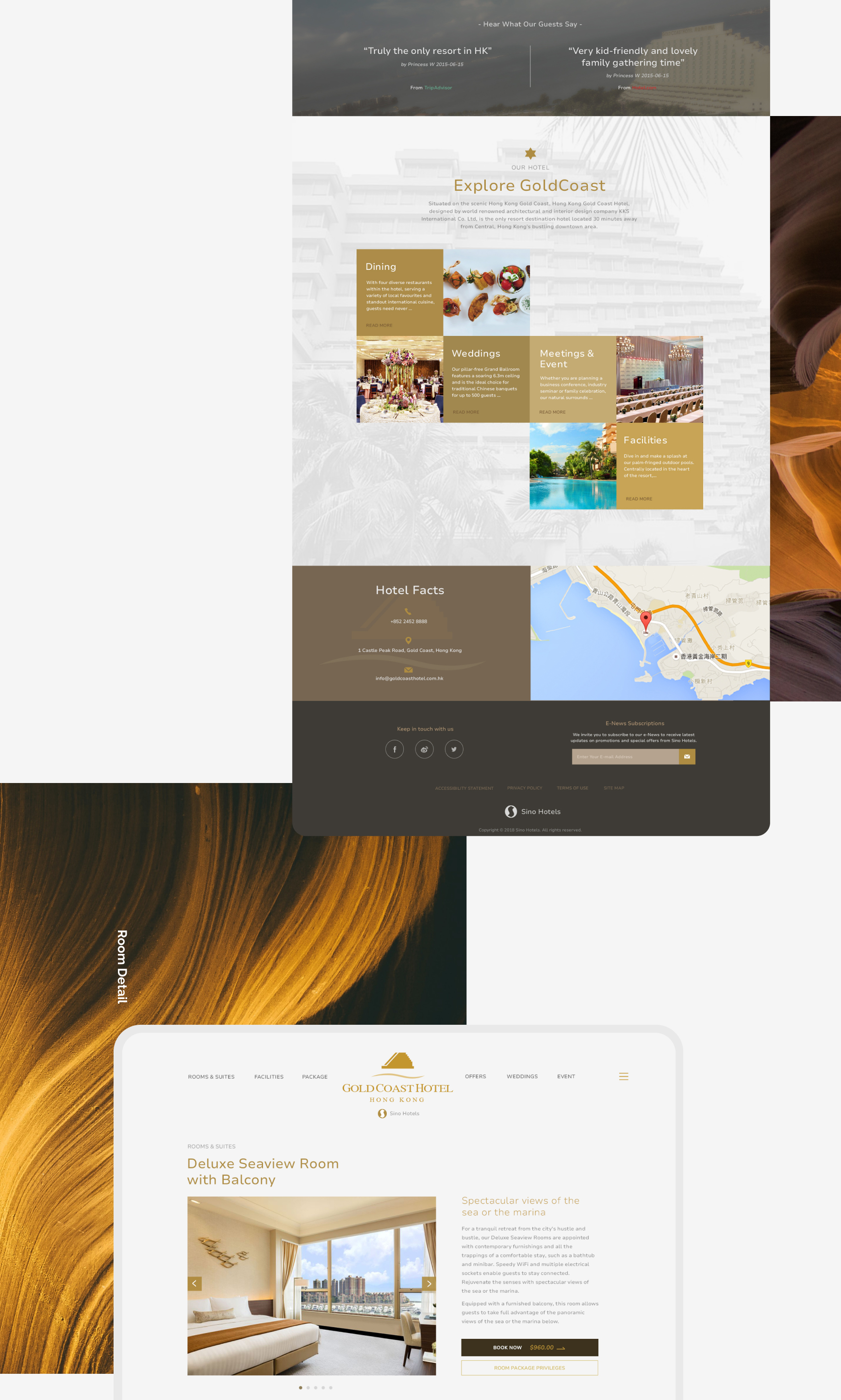
Booking Process
The newly booking interaction where divided into three steps with process bar illustrate which step the user is in. This give the processes a more visually layout which reducing the effort needed to complete booking. Users need just the right amount of information to make that booking and rid of any clunky with users, so users would naturally follow their instinct make it smoothly.
play_circle_filled Click on prototype to Play / Paused demo
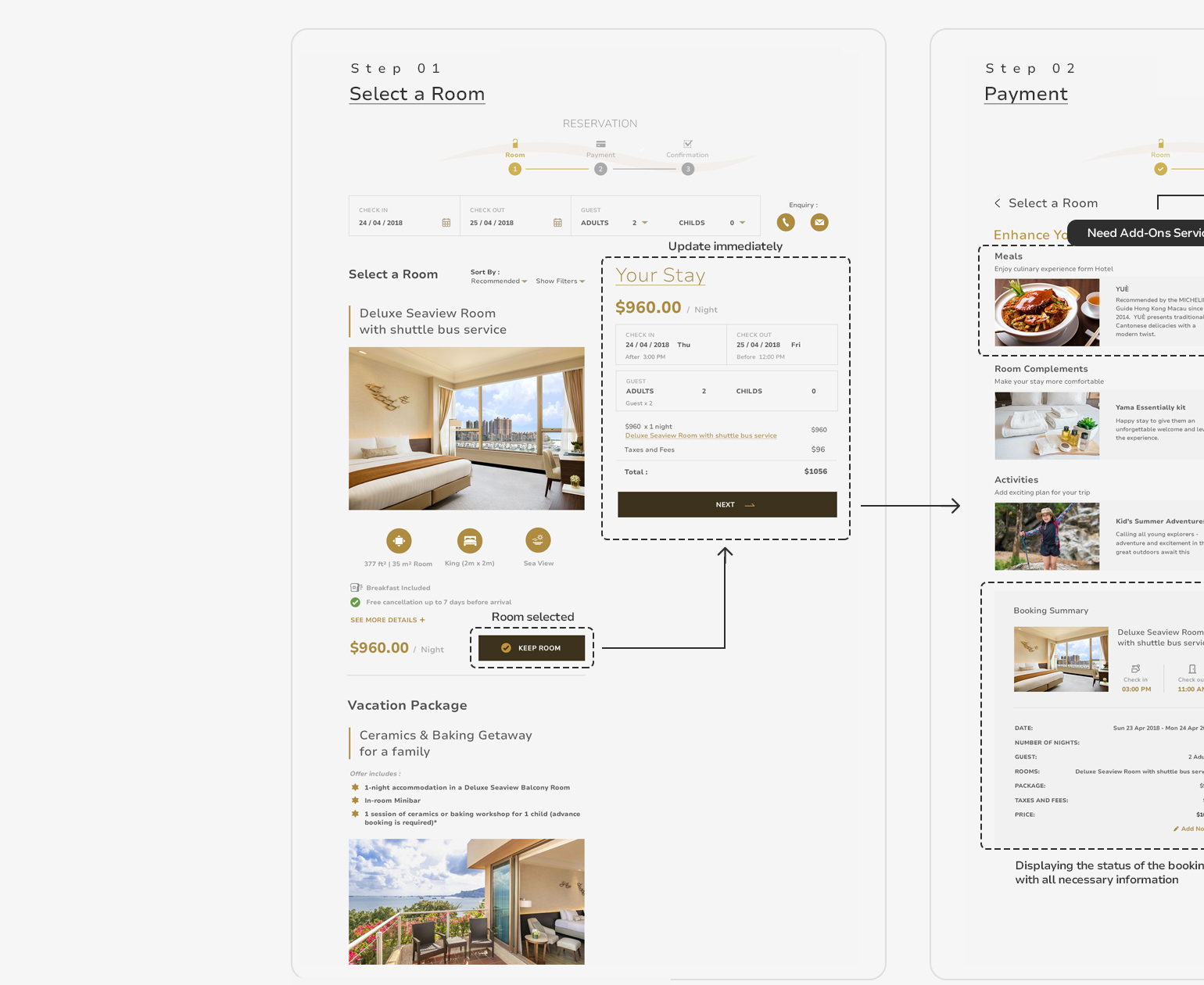
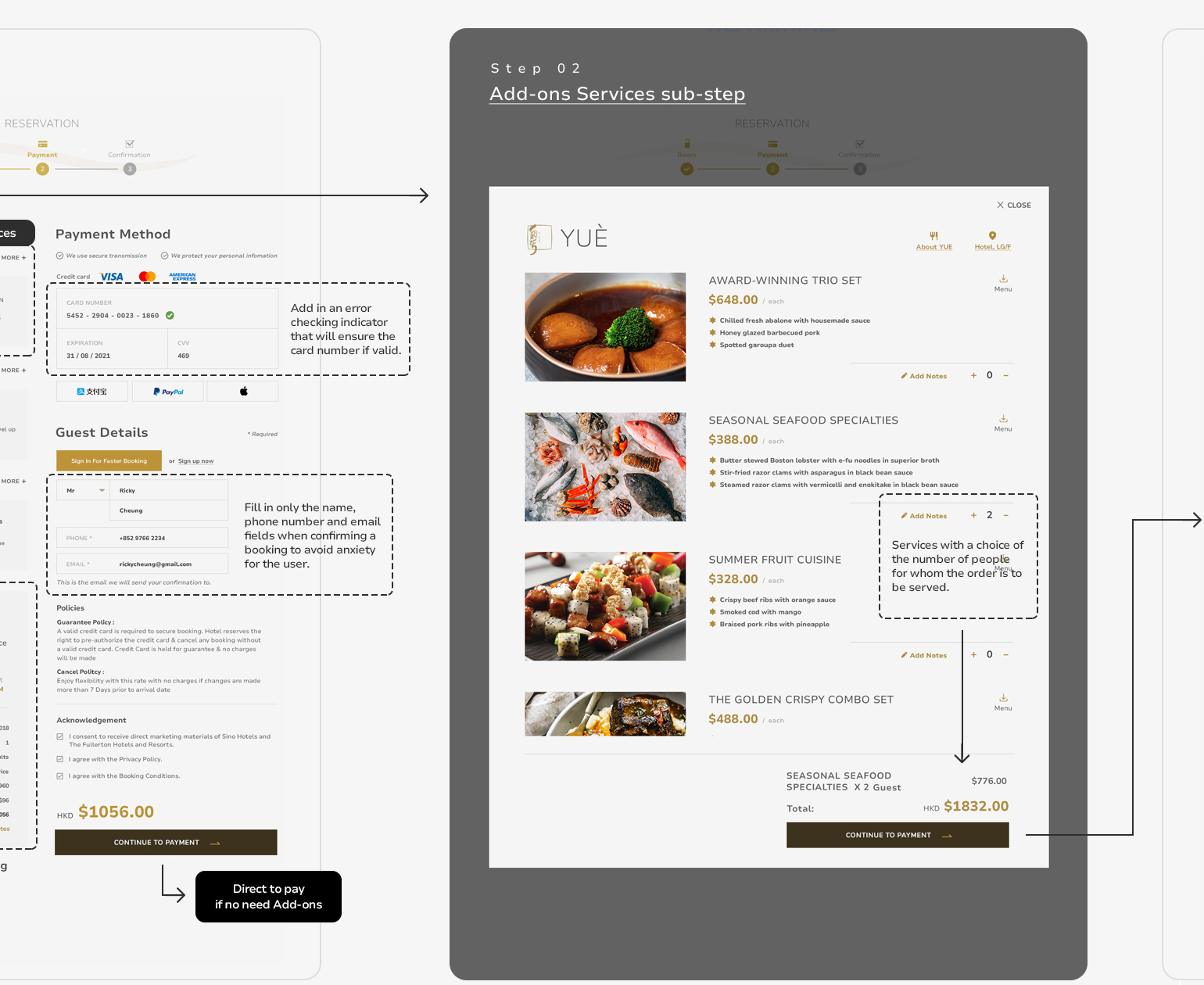
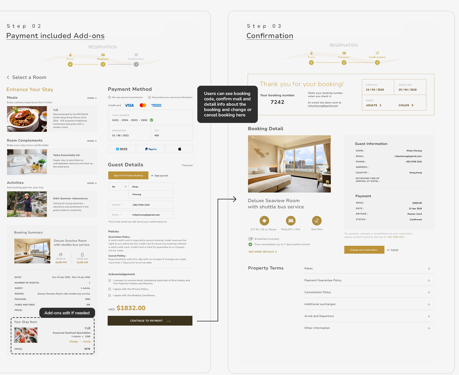
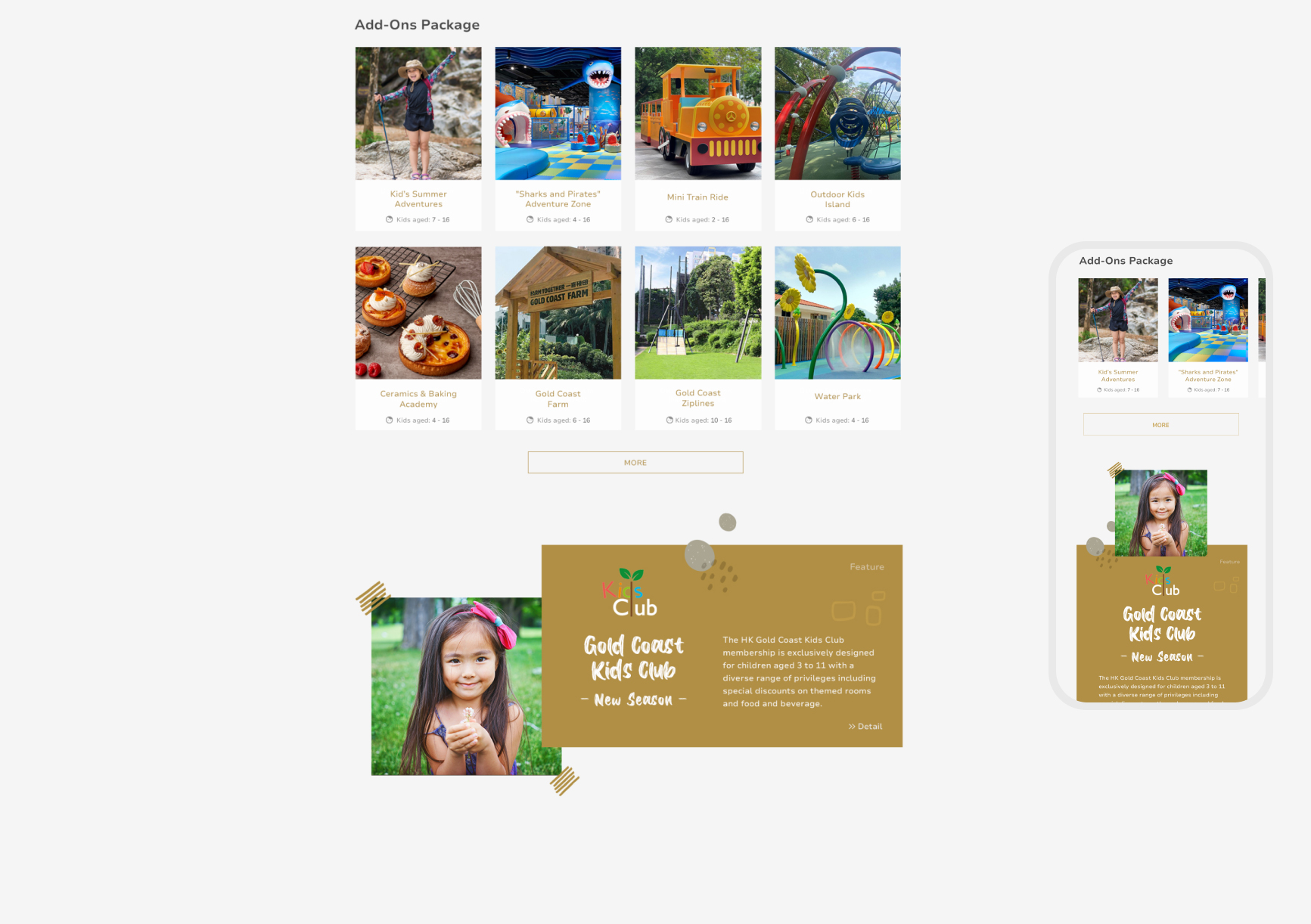
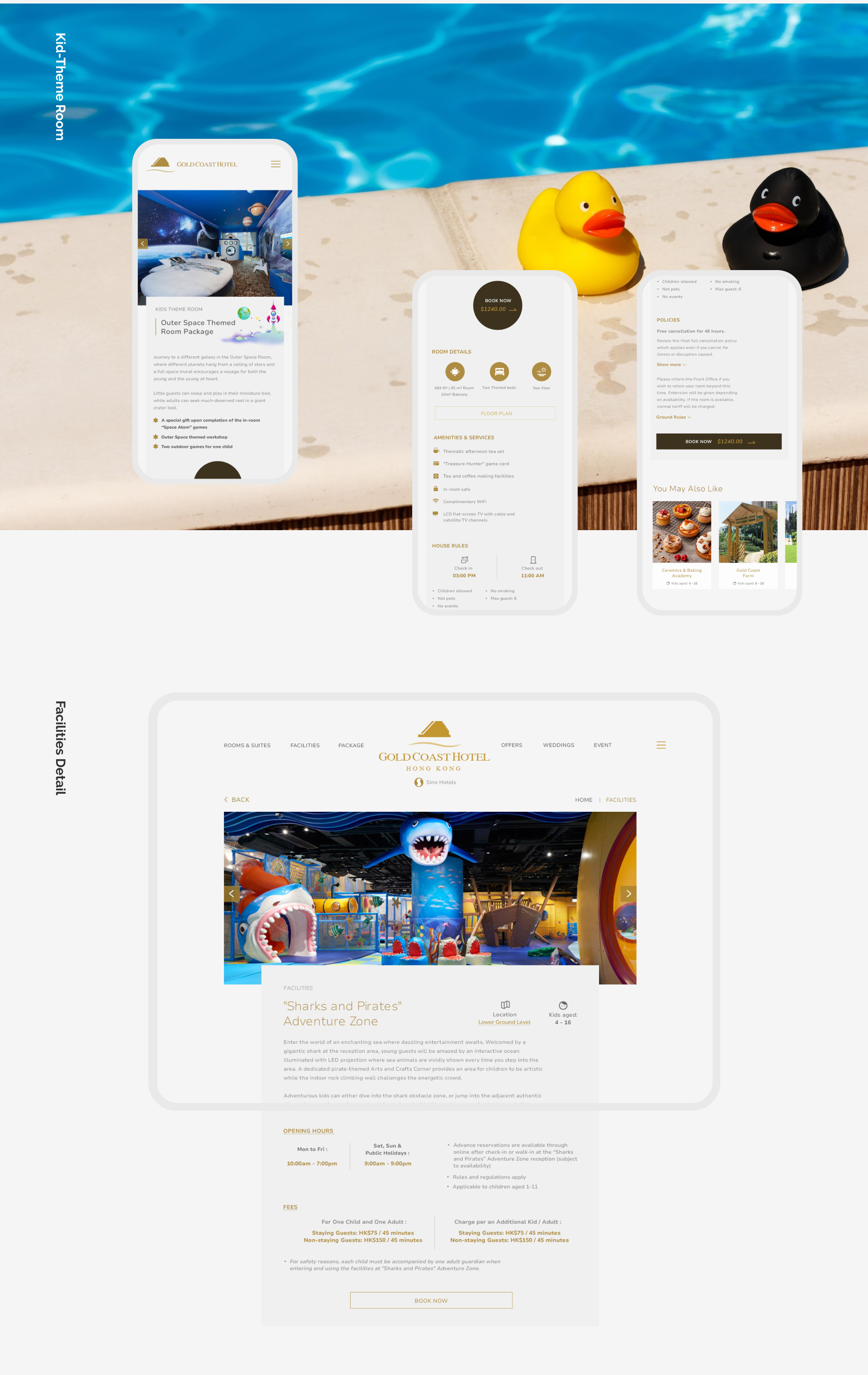
Add-ons Services sub-step
We created pop-up sub steps so that the user is not disturbed in the selection or reading process. Users can add the quantity of the add-ons that you would like to buy, plus adding notes or special request to it. Then, if users want to know more about it, you can simply click on the the images or "About" button, to see the detail.
play_circle_filled Click on prototype to Play / Paused demo
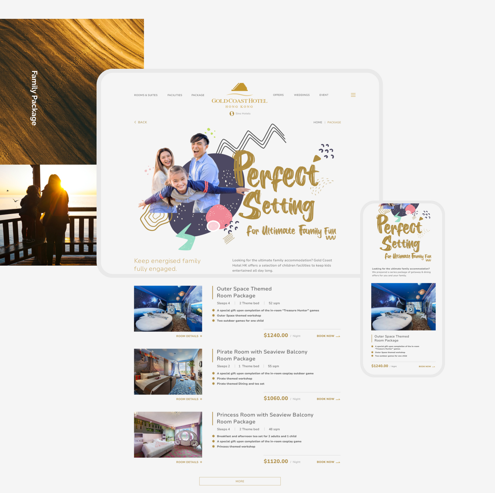
Capturing Family Audience
The purpose of most users visiting the site is to book family packages. Therefore, as family packages have a high priority. We designed a dedicated page with key visual to fully attract potential target group which showcases various family packages and its add-ons services.
play_circle_filled Click on prototype to Play / Paused demo
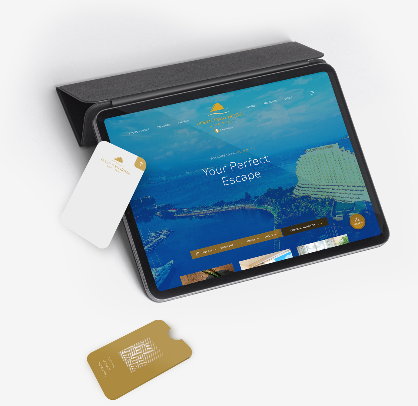
Improves Landing Experience
Rapid search bar is better catered for accommodation when the guest landing. Any prospective guest who is exploring a hotel website will want to rapid know if there is availability during their travel dates for them to stay there.
The whole design has a clear layout that balances hotel information and visuals, but are still informative and feel vibrant. Time is precious and a user is not going to enjoy excessively scrolling for hotel information.
Full screen menu able to users up to speed with information quickly before they start booking. The menu opens across the entire screen, providing enough information without looking cluttered.
Takeaways
It is important to ask for information from stakeholders, and details that we might not know. Prioritization of information is really important, both from a client and a business point of view.
We encountered a few design constrains from the angle of hotel business. This experiences reinforced communication with large enterprise and how to strategic booking detail from the my team rather than client technical team.