
Design Context
The Project
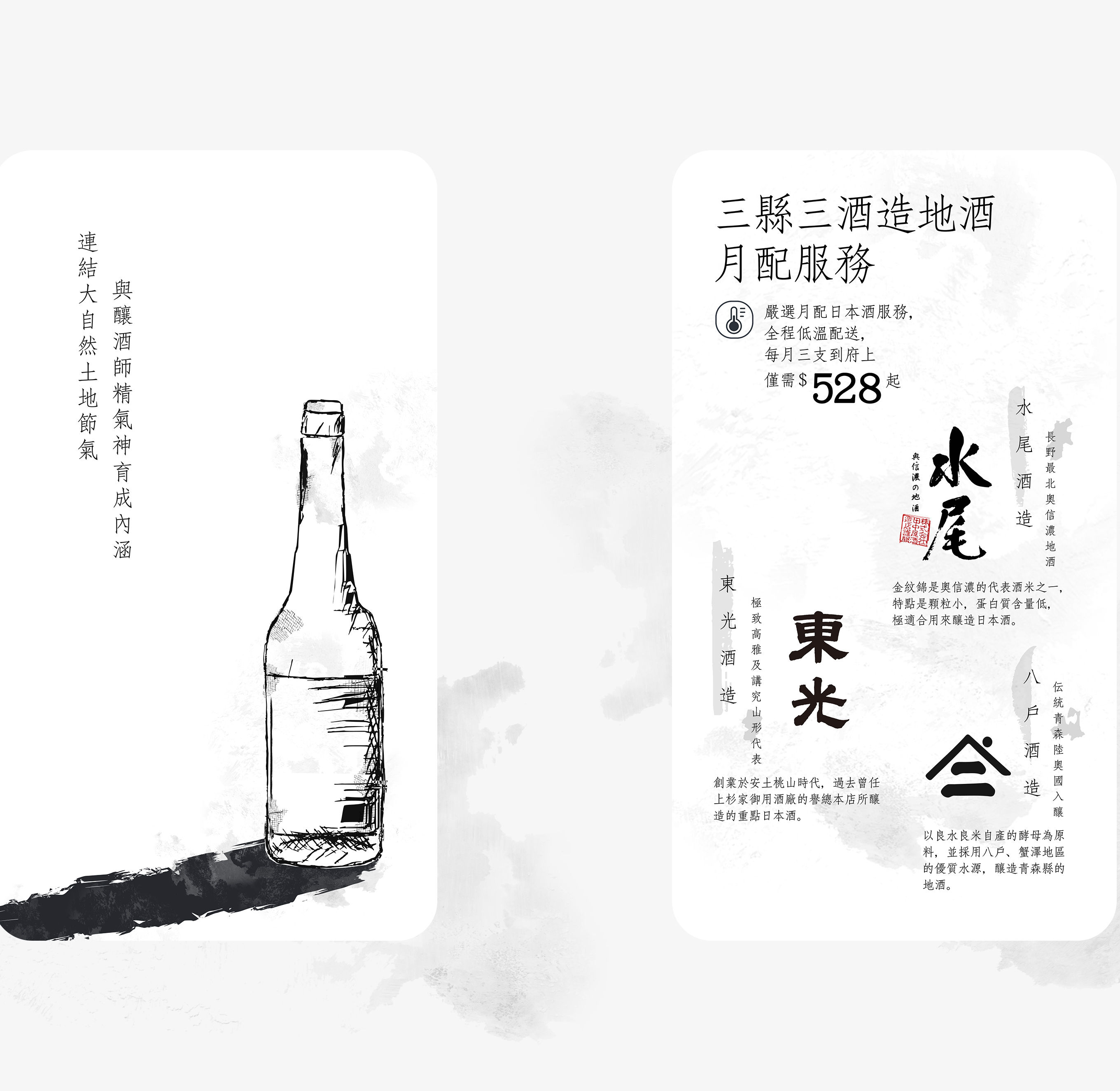
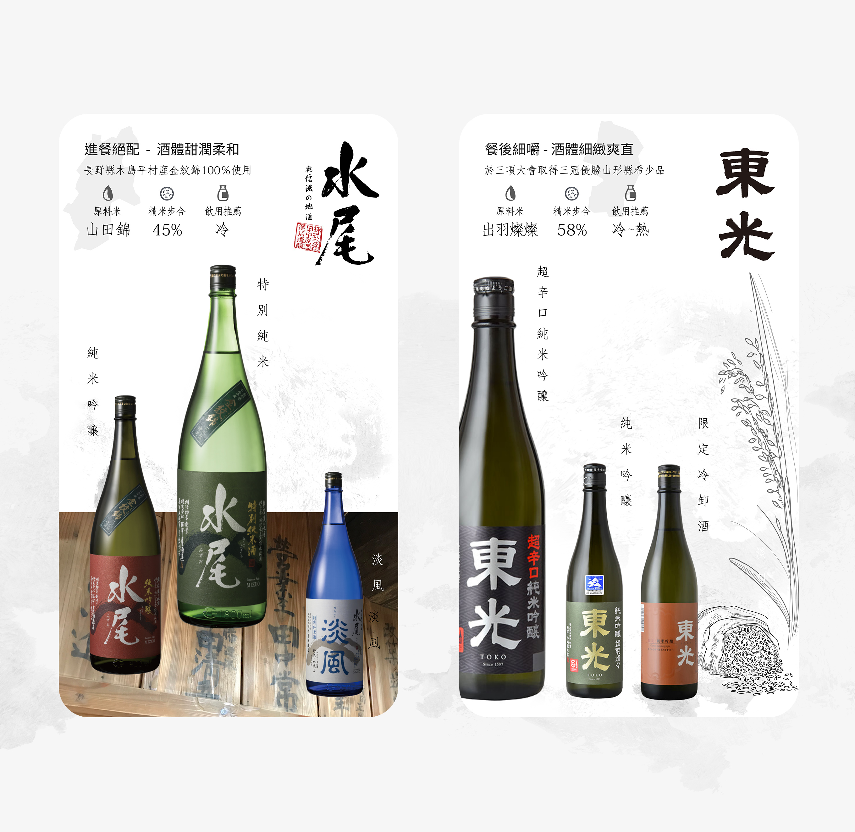
The main objective of the project was to create an effective and engaging monthly sake delivery campaign to increase sales in the online store. The campaign was designed to allow the target audience to experience three entry-level local sake (地酒) from Japan's regions, seamlessly guiding customers to make purchases on the website to build intrigue and demand for new services.
Campaign Touchpoint
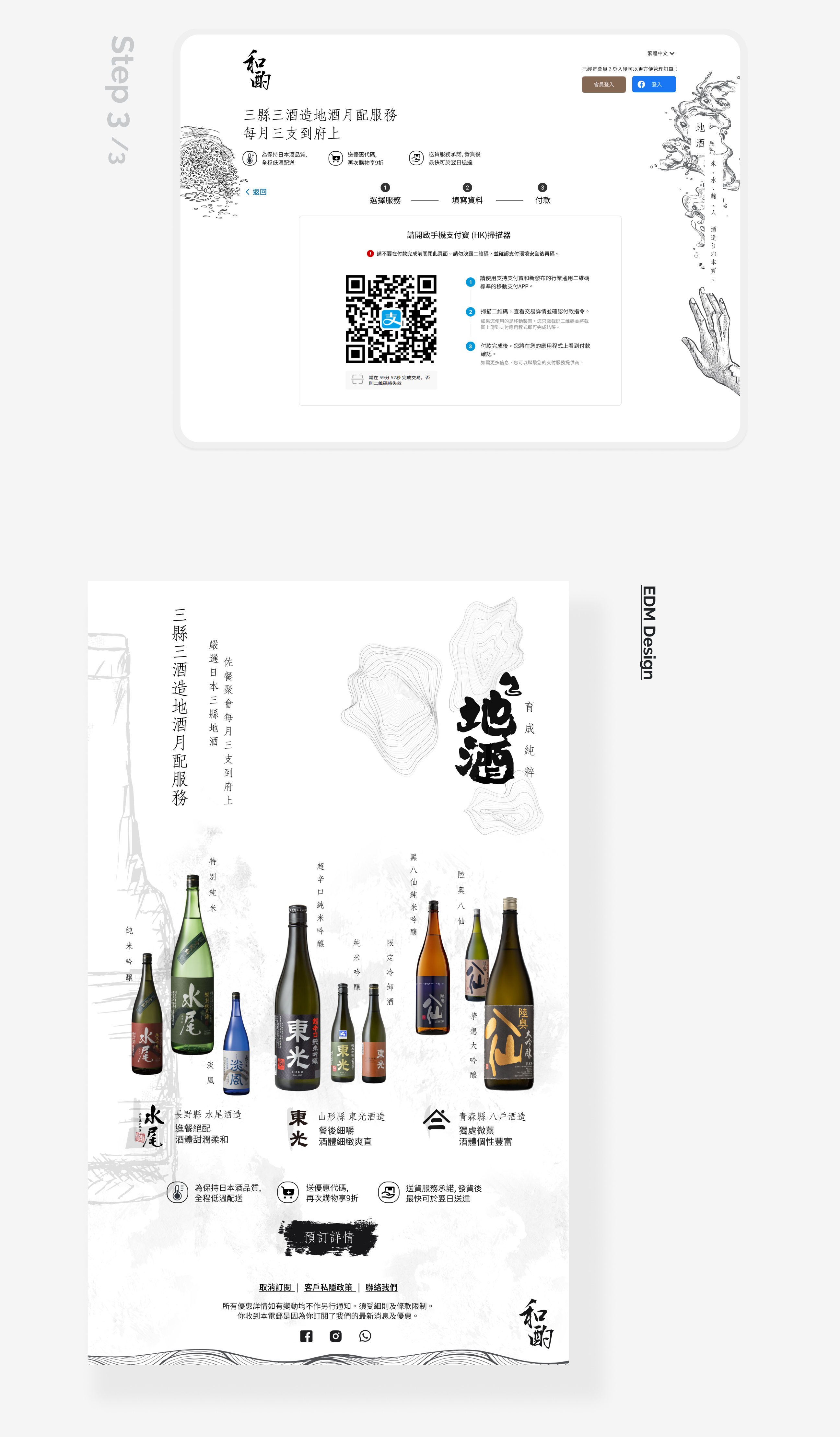
The main target audience was somewhere between sake beginners and slightly more experienced tasters who were at home on weekends with friends and especially at parties for house parties. Social media platforms and customer subscriber databases (EDMs) were used as the first touchpoints, giving the customer sake details that they needed to know before purchasing goes perfectly with their vision and business.
Design Challenge
"Communicating the richness of sake's inherent appeal to both beginners and slightly more experienced tasters, as well as the best way to sample sake at home or friend gatherings, makes it easier for them to make a purchasing decision at two campaign touchpoint."
Ideating the Design Concept
Idea behind the brand
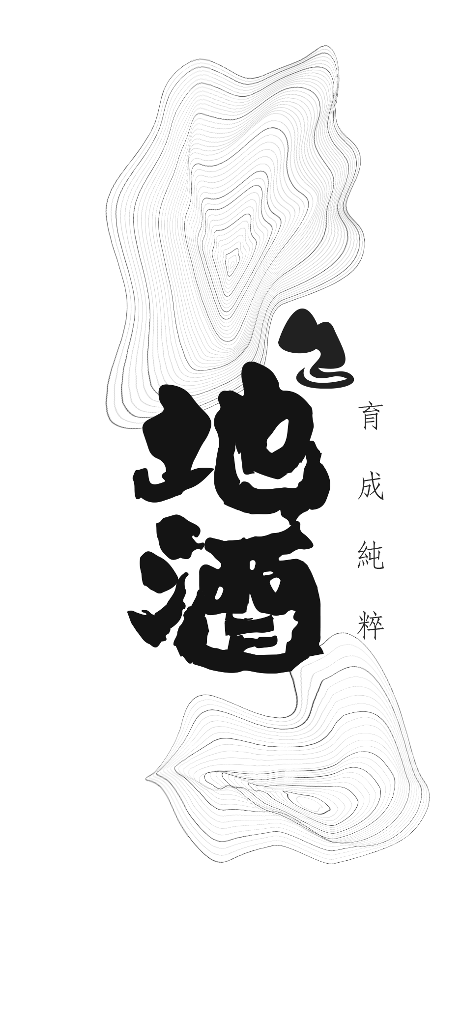
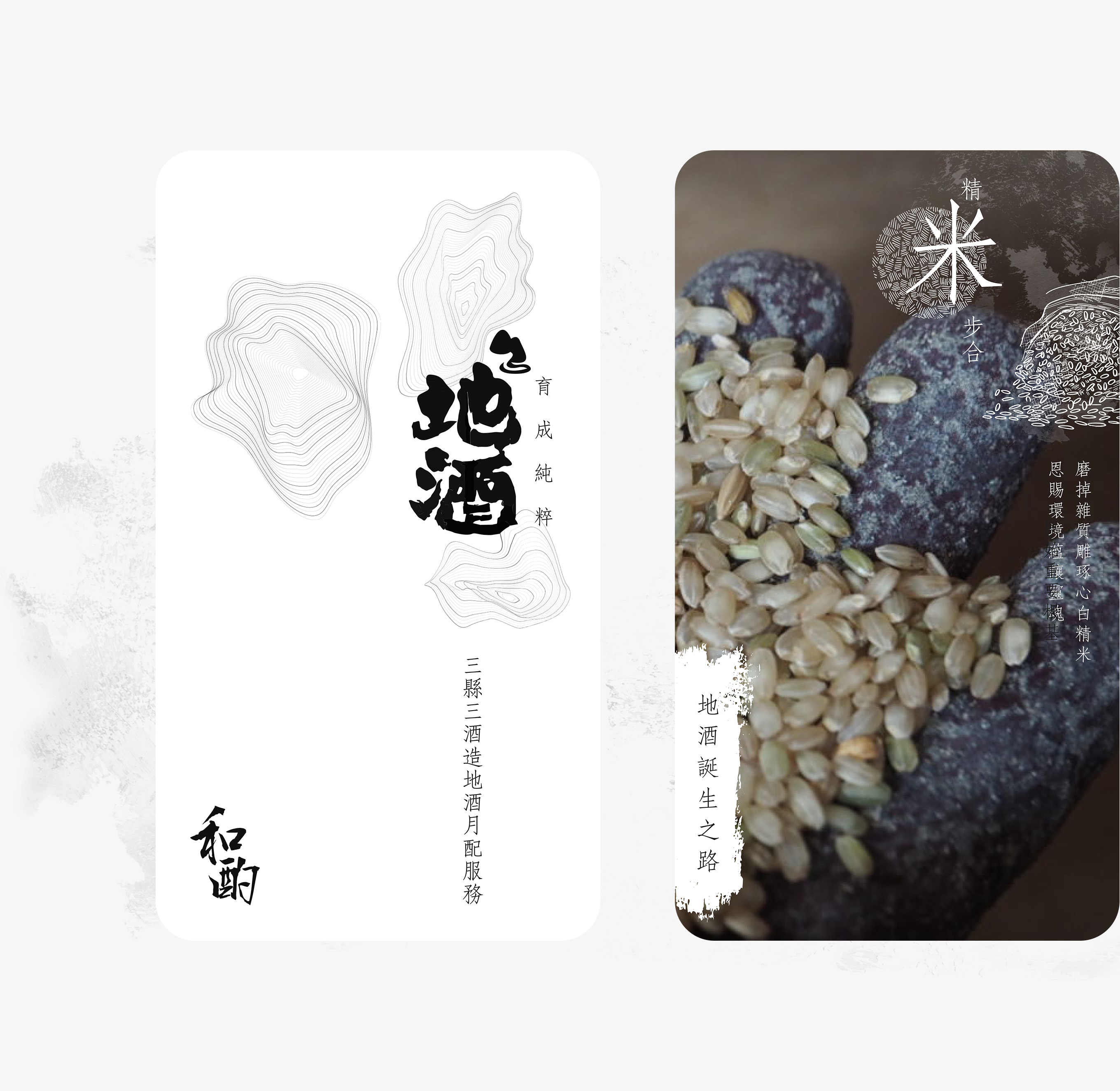
"傳遞純粹" is the unchanging core value of "和酌", representing the natural respect that surrounds all sake lovers. I gained a rough understanding of the characteristics of local sake production in my desk research. Sake has had a close relationship with the natural environment of Japanese people since ancient times. Using "Rich Natural Resources" and "Japanese craftsmanship" as design keywords. I designed "地酒 育成純粹" as the headline, which is in line with the brand slogan and evokes the audience, which is the key message to keep them scrolling.
Establishing the Visual Communication
Capture Features and Message
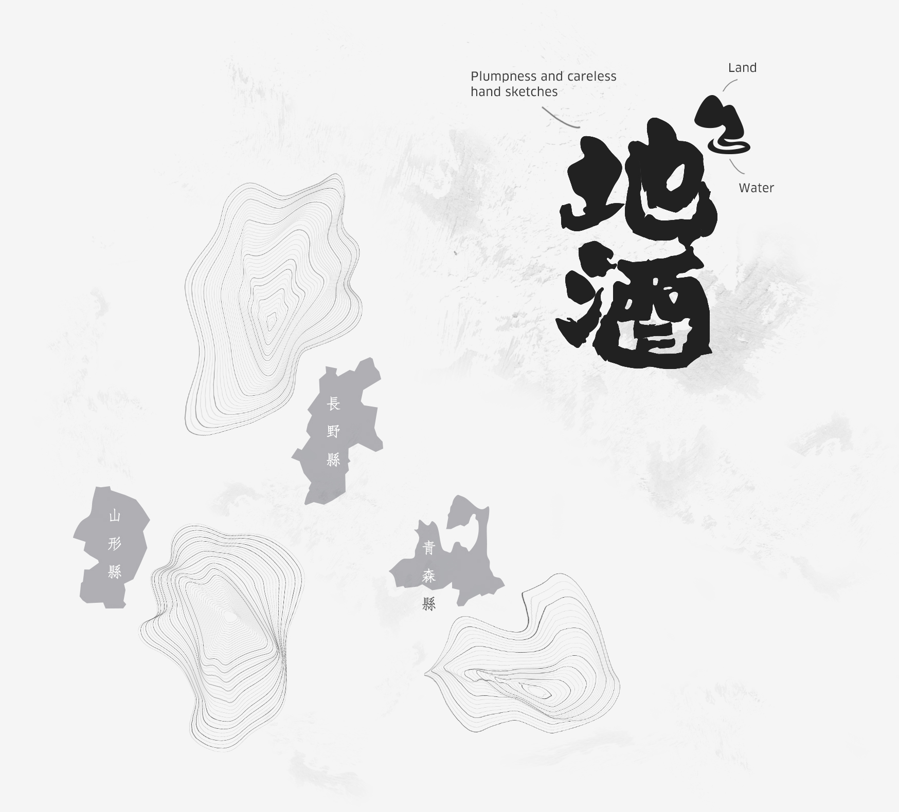
Designed campaign headline that presence of contrast between natural and geometric its plump writing style font look that is both visible and flexible. Meanwhile, the combined landforms of Nagano, Yamagata and Aomori - the three sake-producing regions - and the dynamic lines are the key visuals, expressing the passion for natural Japanese sake and the brand's respect for its own land.
Moodboards
Inspiration
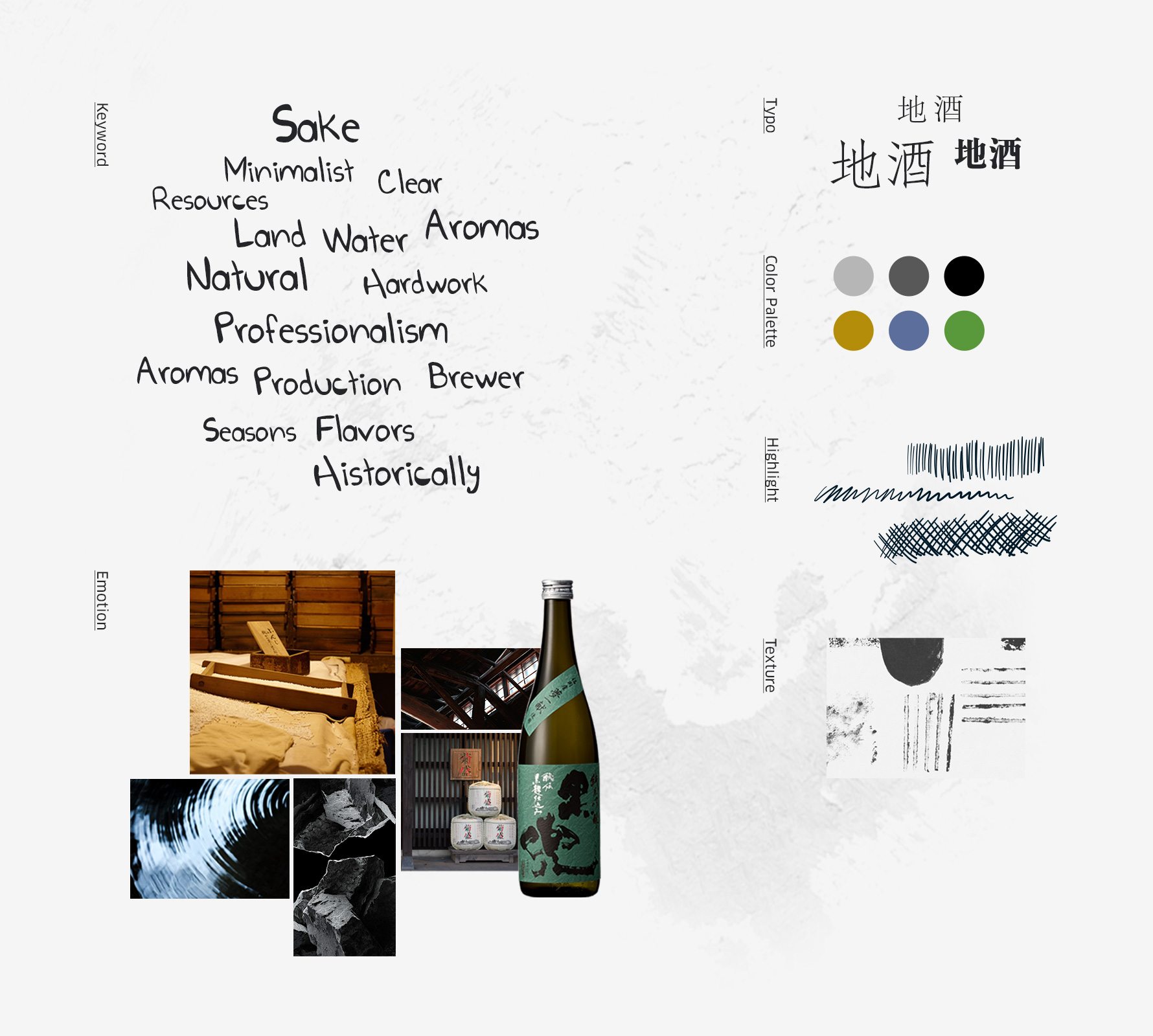
The whole theme only uses different proportions of dark grey and white that specially colorful wine label and bottle through a simple and clean language. The typeface is in FongSong with subtle changes in strokes reflects the content delicately.
Enrich the Campaign Story through Sake Brewing
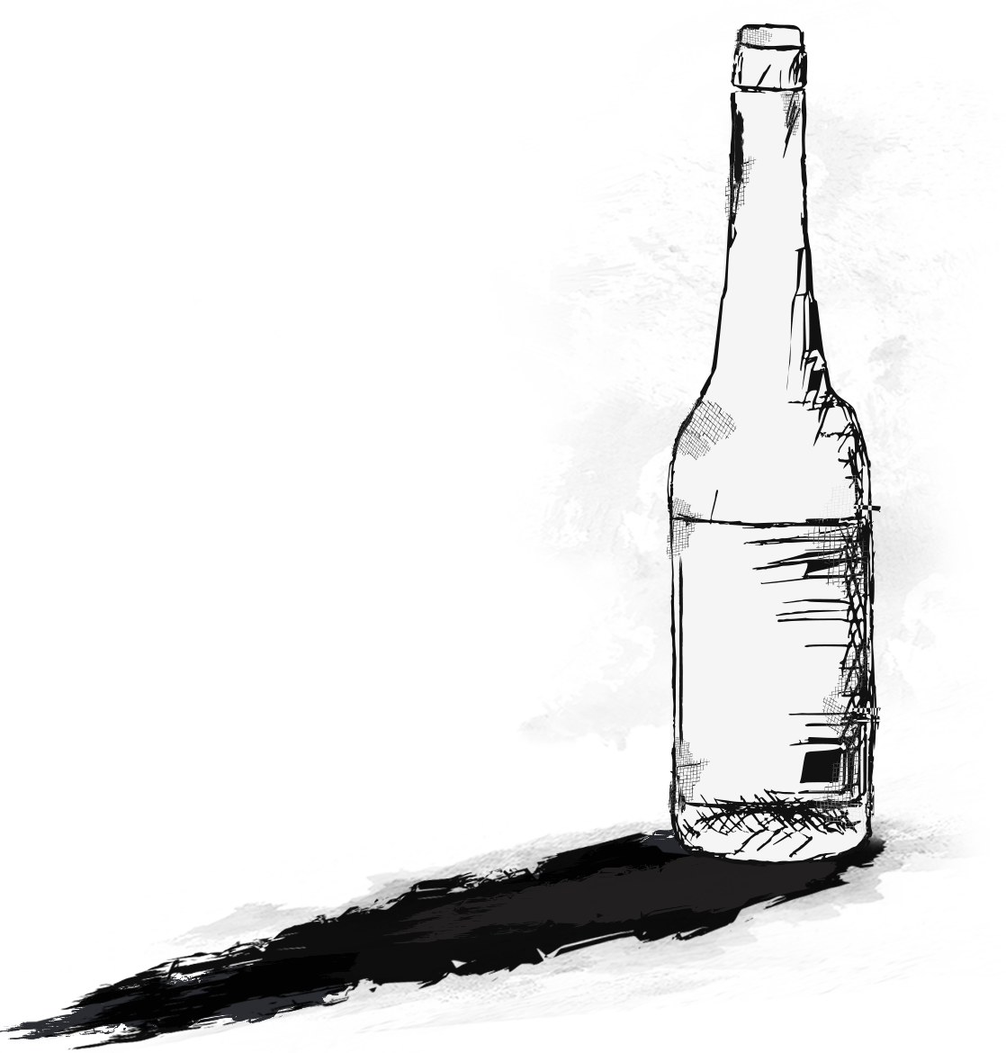
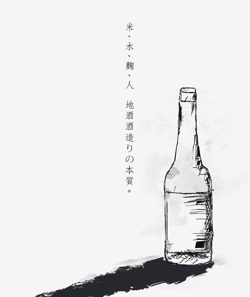
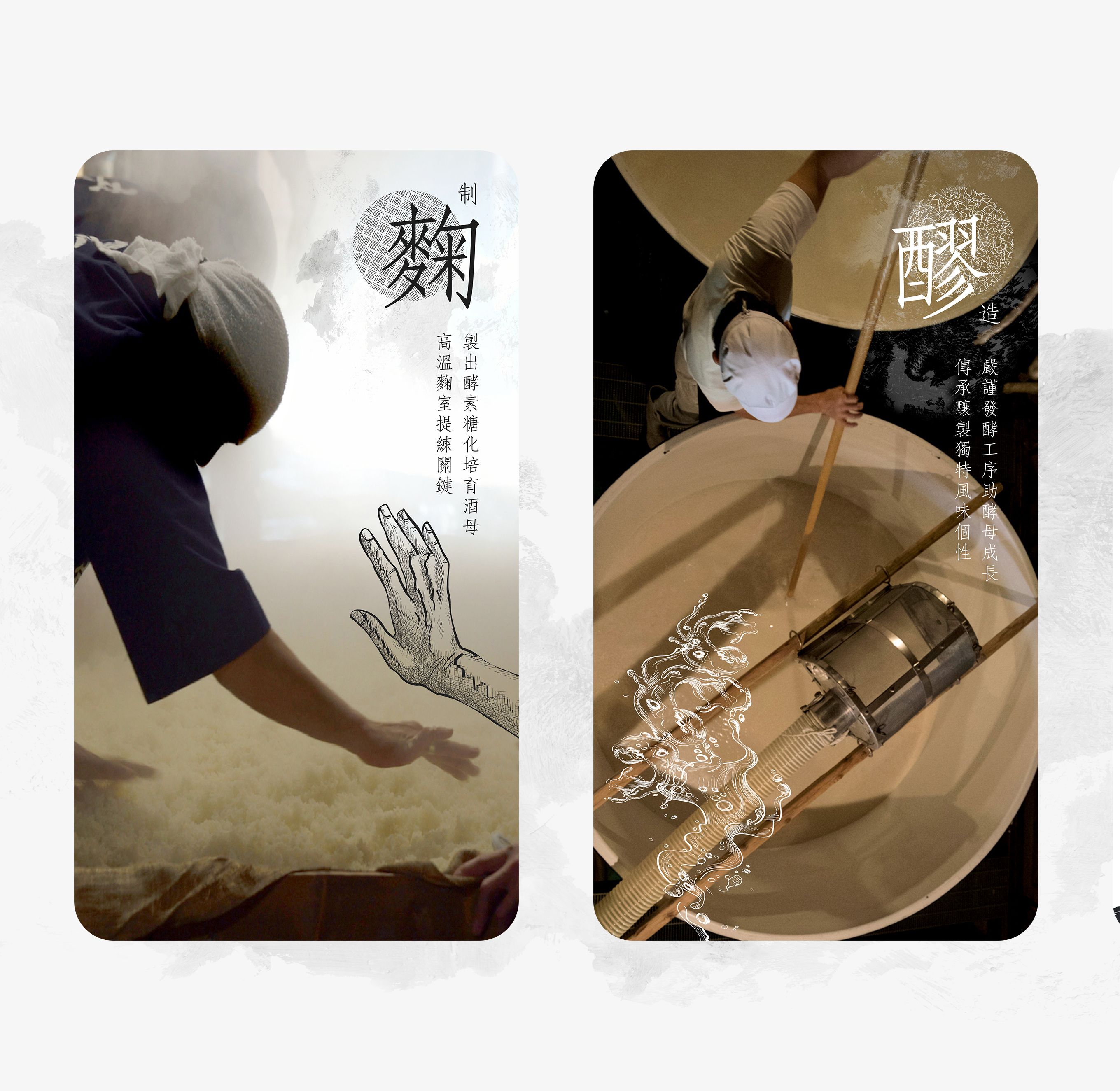
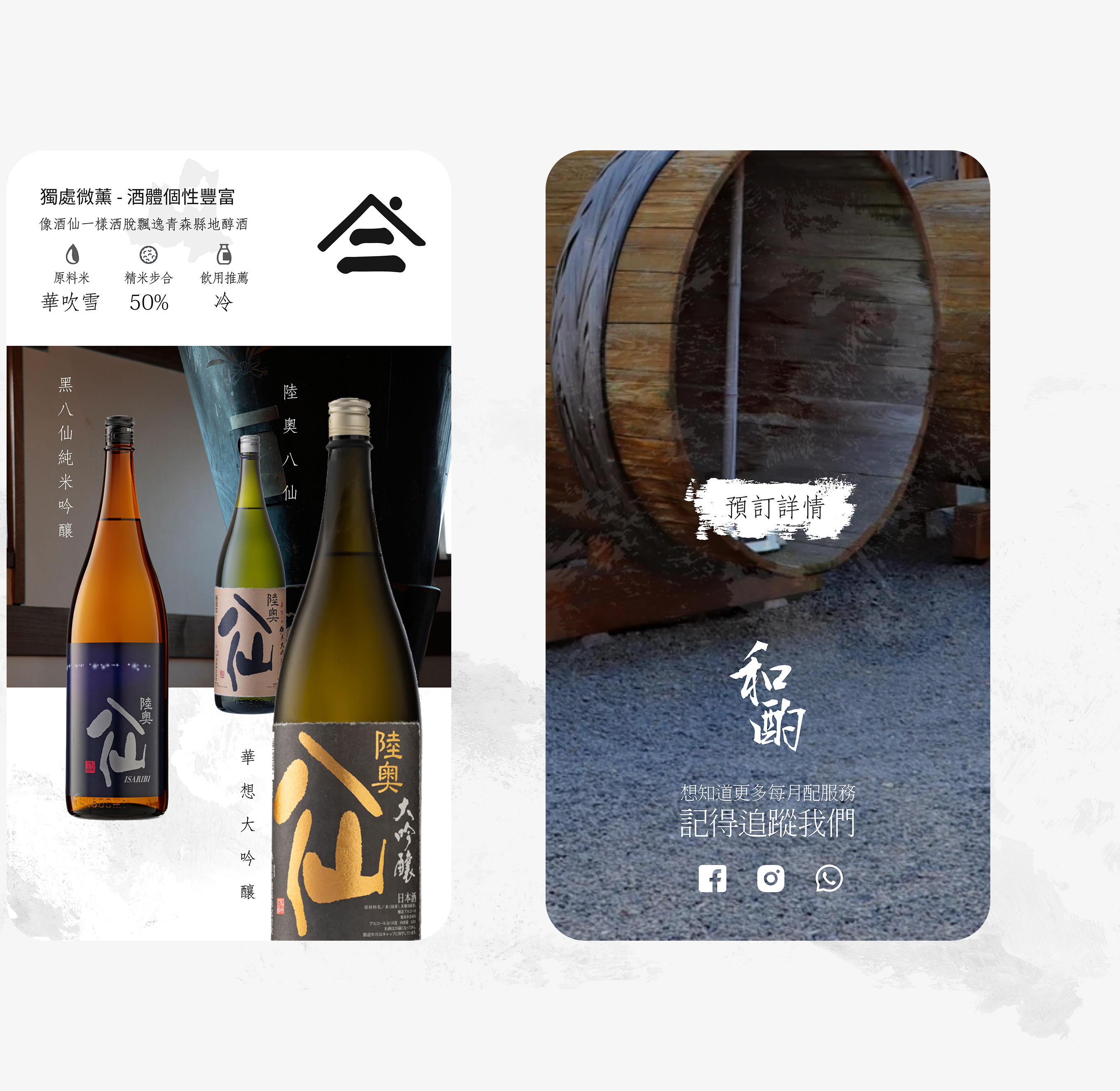
To further convey this message to the target audience and make it easy to remember when touching on social media, I designed the three key brewing processes visual elements of “Rice Polishing”, "Koji Making" and “Fermentation” which specific technics about how to brewing good sake. This convey the sake brand's deep connection to the land, Technique, Hard work and Authenticity. Using the descriptive background images and features of "酒造" combined with the raw style of the sketches and pattern, it shows a journey of discovery and respect for the terroir. These sakes are alive.
Specifiy Purchase Form Design
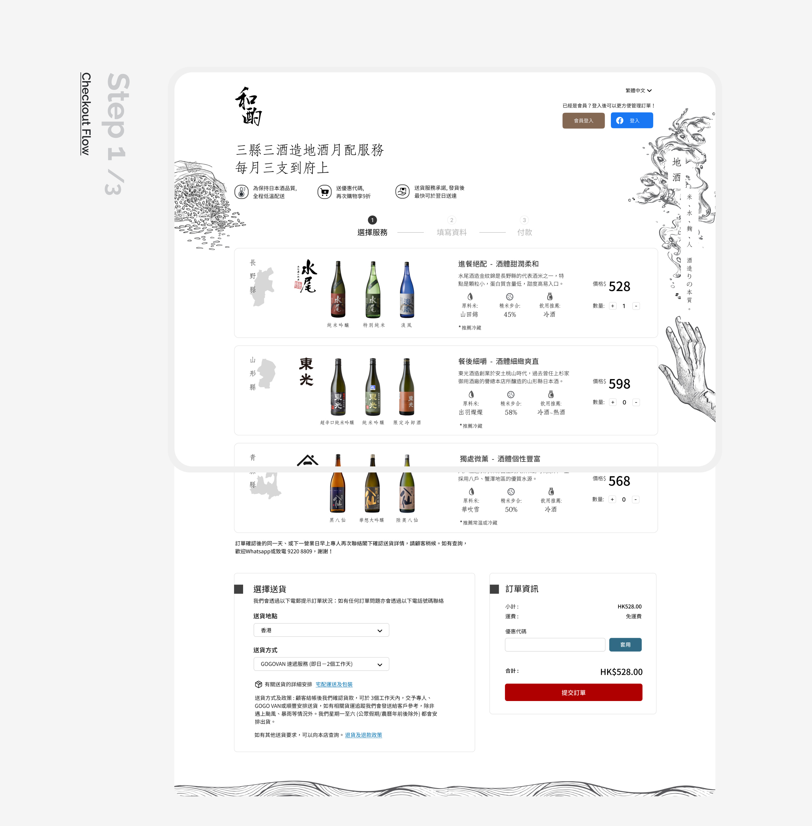
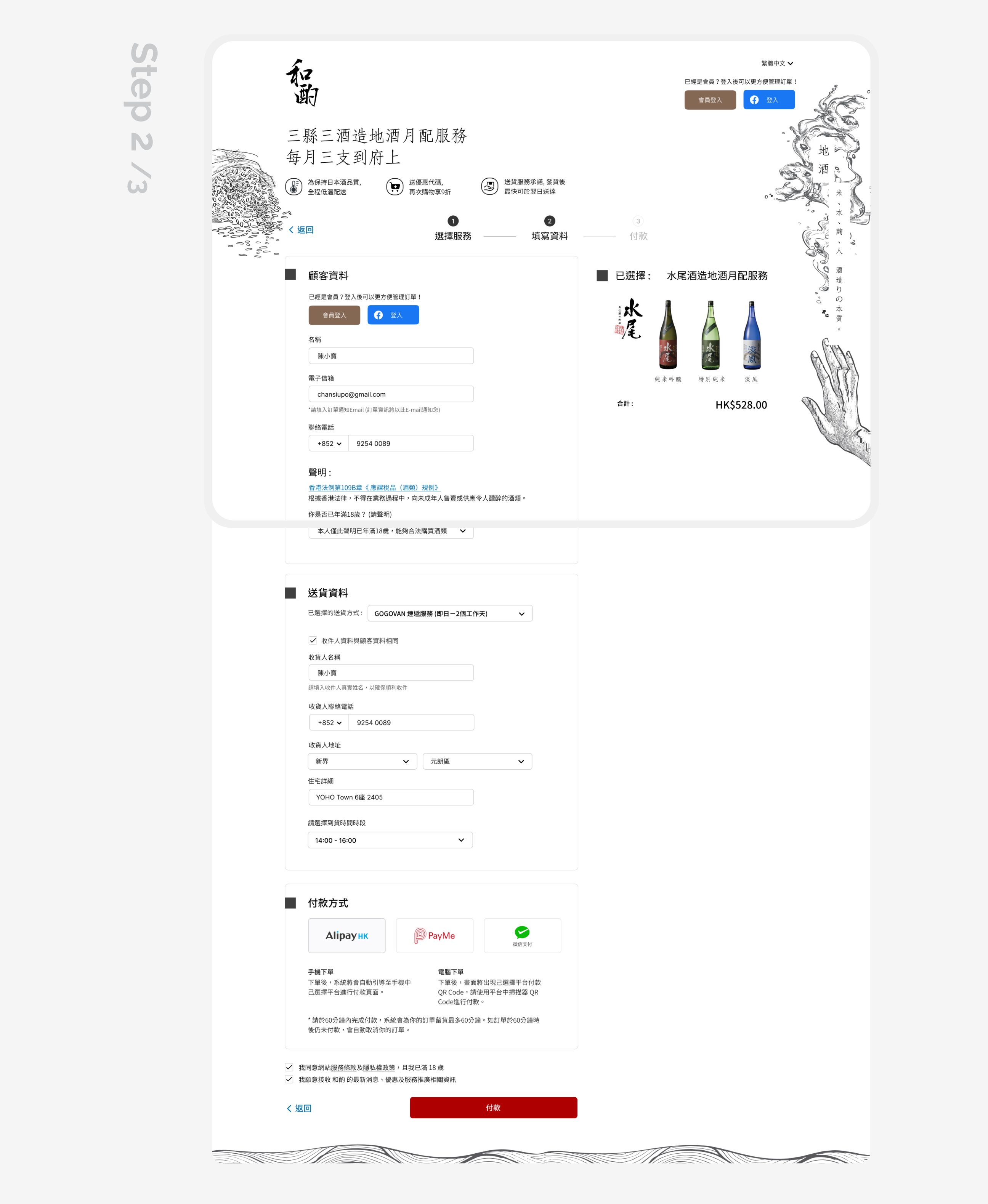
The newly designed order forms as a second touch point. Whole design was maintain campaign consistency with customer experience that greatly communicate customer perception.
play_circle_filled Click on prototype to Play / Paused demo
Takeaway
Whole freelance project was designed with the trust of the client. There was ample time for handover details while working cross-functionally with the client's team. It helped us quickly pinpoint problem areas and address development bottlenecks. Next phase, is to enhances current website visually appealing and fosters long-term relationships with the customer base.
