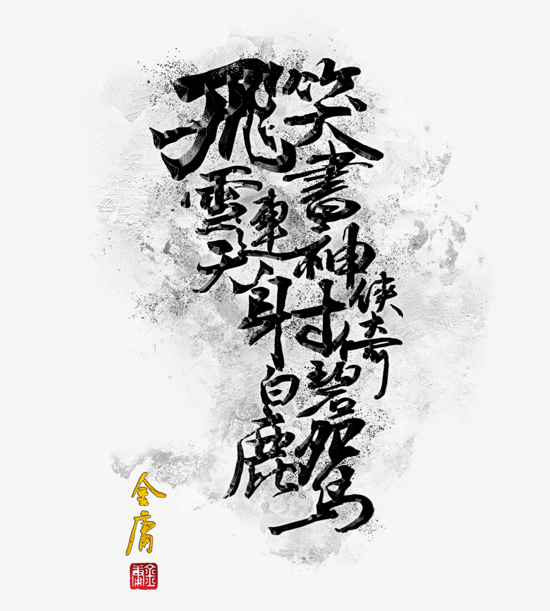
"凡有華人的地方,就有人認識金庸!"
Design Context
Overview
Develop a themed bookstore experience based on the ambience of Jin-Yong's novels. Aimed at a user-centric approach that was fulfilling novel lovers' reading habit, and rebuilding relationships between martial arts novels and audiences deeply.
A solo project involving UX/UI that I started based on my experience and design challenge. Dr. Jin-Yong's novels helped people inspire their fantasies, including ME. Here, I will share the entire design process I went through to build reading platform.
The Problem
Existing Jin Yong's novels reader app were not portraying value and long-term reading behaviour to their audiences
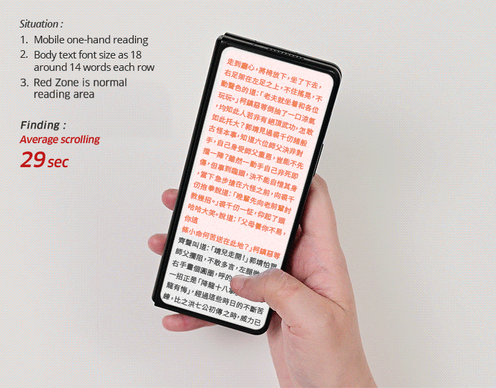
Dr Jin Yong's is legends of martial arts novel. His works are fantasy and iconic. Most readers have expressed their love for his works. Normally, people read a novel takes long time. But nowadays it's not easy for people to find time to read. These readers "enjoy" novels so much that they spend more than 2 hours on average. In addition, when reading on mobile phone screens, they often have to scroll down or to the left, which also makes for an uneven reading journey.
Design Challenge
"How might we make the reading time of Jin Yong's novels more manageable so that the reading experience is more enjoyable and conveys its value stand out from other competitors?"
The Solution
Create the immersive reading experience by turning the eBook reader into a Jin Yong themed bookstore rather than a text-only eReader, differentiating it from competitors in the market.
Establish reading traceability allows users to take full control of their time. Meanwhile, the tablet-first approach gives novel readers a comfortable reading experience, even for wordy martial arts novels.
Research and Discovery
Understanding the Novel Readers
With 8 people who read novels to gather different perspectives, all of whom had experienced it before, and try to get their thoughts. I asked them questions via Facebook Jin-Yong's novels fans group :
Plus, I assigned some simple tasks to 2 people to see how they would personally use it and identify reading issue. There are:
#1 Usability - in-App Reading
#2 Feature - Check Reading status and History
#3 Behaviour - Time Spending
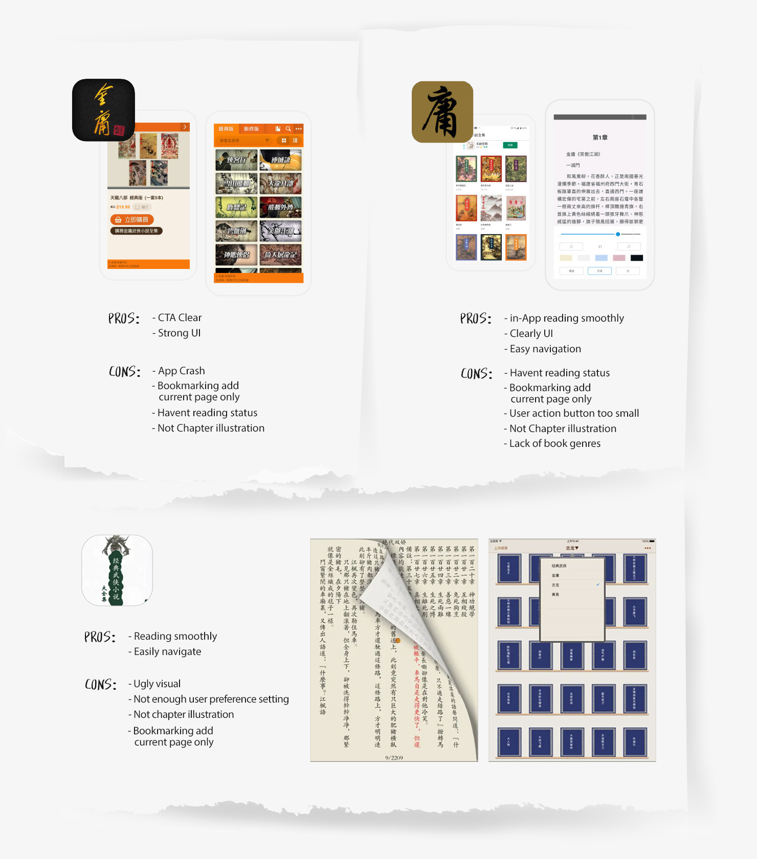
Analysing the Competitors
I tested 3 competitior on the playstore which gave me current app patterns and which feature have. Majority of competitior was lack of a detailed information about the reads activities. In addition, the key findings was chapters illustration are missing, which is crucial of martial arts novels structural of integrity.
Defining the Problem
Breakdown the problem
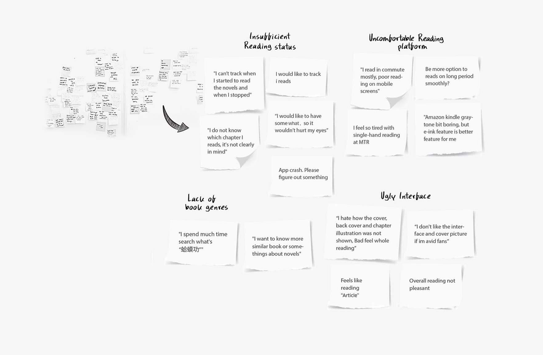
Next, I compiled all the feedback, Play Store review and testing result listed above and grouped similar are. The major pattern discovered over 80% of Jin Yong's avid readers, while other 20% are infrequently to read most of the times. From this, I summarized four factors which are about:
tune
Insufficient of
in-App reading feature
Over 75% frustrated with limited reading feature. Most user said: "It just save pages I was reads". Only a page bookmark feature that caused inconvenience due to long period reading especially.
Takeaway :
Exsiting app doesn't fullfill reader situation and behaviour. They mostly spend up to over 1.5 hour on novels. Unsure how many time spend on novel reads. So, they wish to more info about read status.
mobile_off
Uncomfortable
on mobile reading
Over 60% audiences dislike read novel through mobile, they need much scrolling and swiping on the screen frequently, and also said loss concentration during reading period they felt. Observed among some major users prefer to hard-copy and Amazon Kindle reading at home.
Takeaway :
Despite mobile usage widely, but mobile screen doesn't match up with thier reading behavior, which means small screen not ideal for read text-heavy martial arts novel, and cause eye strain occurs in concentration reads also.
sentiment_very_dissatisfied
Unattractive Interface
Over 40% audiences feels bored: "Ugly", “It doesn't interest me”, "Seem like reads article", especially avid novel readers mentioned.
Takeaway :
Such a pure of text e-Reader had made thier disappointed which would just turn off the readers interest. Current apps UI was not up to marks as imagery of Jin Yong's novels.
menu_book
Lack of Book genres
As most audience mentioned haven't Jin-Yong's relevant and other categoies at all.
Takeaway :
They ending up chose either which of hard-copy version or online ebook store. Might with chance loss of potential audience opportunity.
Empathize Users Facing
Next, I translated the pain point into 3 themes to establish clear boundaries to determine the scope.
"Readers who frequently reads Jin Yong's Martial Arts Novel, So they want......"
apps Feature
local_library Behavior
insert_emoticon Emotional
Defining the Design Framework
Adopting a hypothesis to driven the design
Below, I proceed by framing two hypothesis based on research previously. That can serve as the basic throughout my design strategy. With this, can be further explored solutions through well-defined approach.
Hypothesis #1
Every novel readers needs a exact status reading
WHY ?
Most people who trend to multi-task nowadays, it's reasonable to assum that readers would want to do other activities like playing games or somewhat on social media while reading. Just a page number bookmarking option can be demotivating thier reading efficiency. So, They valued a tracable status and detail what is reads on. Below are the key findings arcoss the research before :
Average time spent on novels:
1 h
40 m
Average time finish novels :
12
Days
tips_and_updatesINSIGHTS :
"Designated for novel lovers who will spend more time immersed in the app"
Hypothesis #2
Tablet as Primary Reading Platform
Validating :
Jin Yong's novels is a text-heavy fiction. Novel readers would not be rush to reading, because it isn't online article or news. Typically, mobile is not suitable for reading long novels. Increasing the font size would not solve the problem, as the screen size of mobile phones is fixed, and would only result in more frequent scrolling.
Below are the desk search result that supports the "Tablet-first" assumptions i analysed :
Most words of novel "天龍八部" :
+1.5
million
Average times of novel reads:
2-3
times
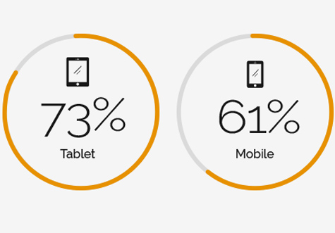
Reading devices for in-depth reading :
Tablet users often reading full long-form e-book :
WHY ?
Tablet landscape screen is almost the same size as a hard copy, which is well suited to human Z-pattern reading. All respondents preferred to read novels with hard copy and Kindle at most, and would like to stay at home to maintain motivation for long periods of reading. That's why tablets are on the rise. Of course, this could lose the mobile user base.
tips_and_updatesINSIGHTS :
"Reading fluency is important because it provides a bridge between effortlessly and comfortably."
Hypothesis Statement
"We believe that if we provide more information about reading status, which helps users to fully control their reading time. In the meantime, it's crucial to make the experience comfortable and fluid through the tablet platform. [ Solution ]
Will achieve over 50% in Customer Satisfaction (CSAT) throughout the reading experience.
[ Success metrics ]
This is because readers tend to know the appropriate time before they actually read. Meanwhile, Due to mobile screen limitations, using on a tablet where wide screen not only helps readers concentrate, but even a ton of words novels be more friendly." [ Impact ]
Ideating the Design Strategy
Proposed Solution
Transform ebook reader into a Jin Yong themed bookstore for an all-encompassing experience
I transitioned the product strategy to built specifically for the tablet platform by re-imagining the themed bookstore rather than a text-only e-reader. This approach was designed to provide fiction readers with multiple levels of imagination, value and comfort to differentiate themselves from their competitors and positioning in the market.
timer
Enhance activitie for long-form reads
Provide more informative of novels activities that include current percentage of reads, Evaluate the finish time of novel and Detail info of last reading.
Apply an appropriate colour scheme for prolonged reading that provides the best legibility to reduce eyestrain from text.. During the research phase, there wasn't any application that offered this option to users.
add_reaction
Connect novel reader to build closer relationships
Provide more categories on Jin Yong, such as Jin studies research and martial arts-related books that expand readers experience beyond novels to broaden the readership.
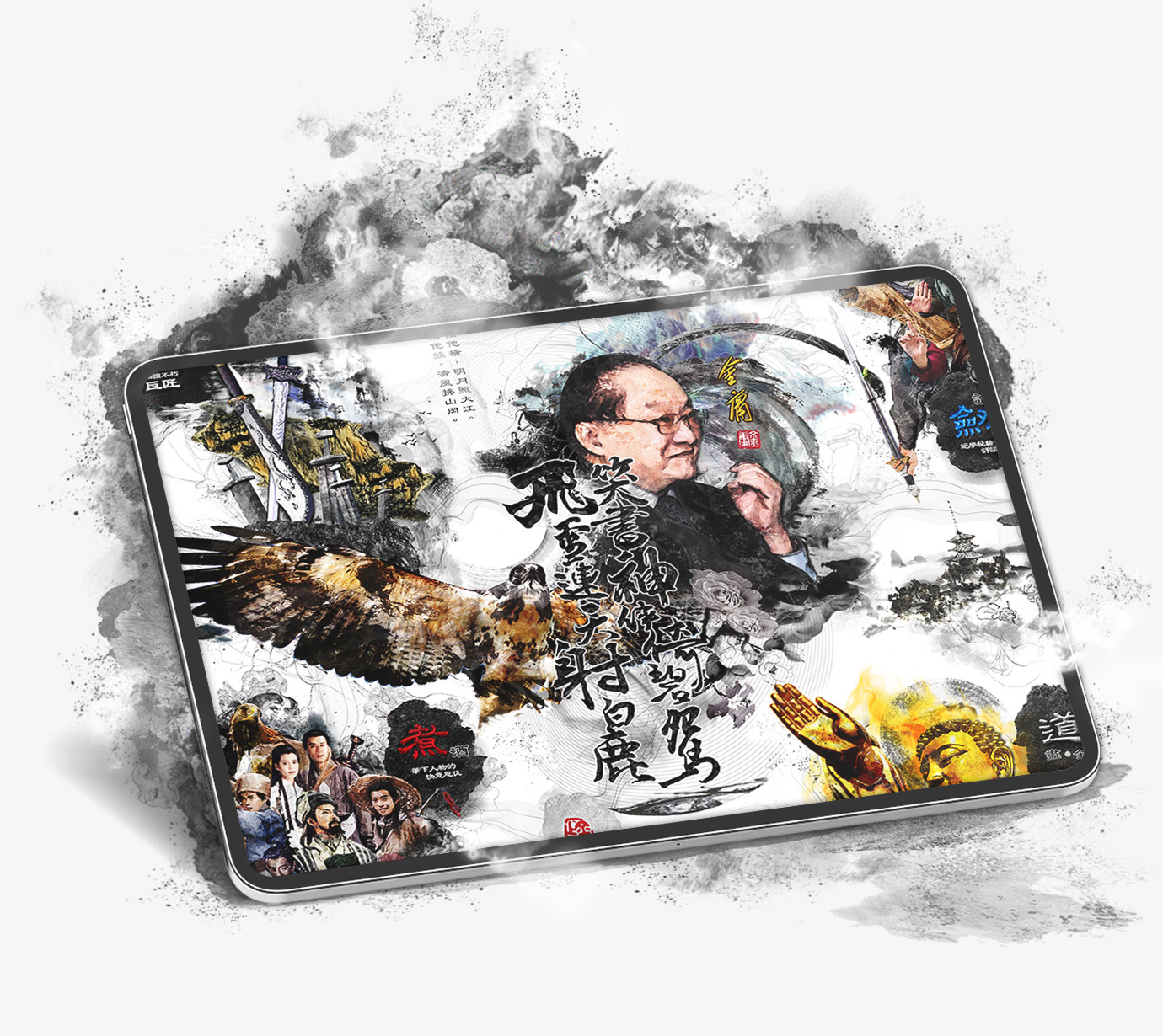
Utilizing novels visual element arcoss the whole UI to enhance ambience of Jin-Yong-themed bookstore, especially presented in Jin-Yong's works was important.
Create value-added content about well-known personalities and martial arts for users to interact with. Make the experience more memorable for users.
Target Audience Stories
Persona "MAX" who is Novel Lover
I setup persona - MAX, to capture the roadmap of our target users describe how a user might think, do and feel about a certain situation through hypothesis storyboarding.
User Journey Map :
MAX as a busy Media Writer in middle-class, valued his time and work life balance. Due to his constant need of writing skill and idea, He love reading. He contemplates what to read something while busy in works after.
① - With about 2 hours left before sleeping.
② - Before starting reading, he looks through the reading prcoess bar and system evaluate time first,
③ - Which make decision how much time available for reading, MAX feels helpfull~ so that he can spend time for some things in home.
④ - By reading on the iPad, he feels comfortable and it fits perfectly. So he can better enjoy the reading time after a long day at work.
Mapping out User Flow
As I mentioned before, the establishment of a themed bookstore is not a redesign of the ebook reader. Here, I validate the bookstore concept and feasibility before evaluating its functionality. So, I created a user flow that guides me with a roadmap to inital user journey.
Concept Sketching
I started with idea sketching about 4 key screens for inital interaction and some UI component in mind on a paper to iterate multiple ideas before settling on one. I didn't spend too much time thinking about the hi-fi wireframes.
Establishing the Design Language
Visual Communication
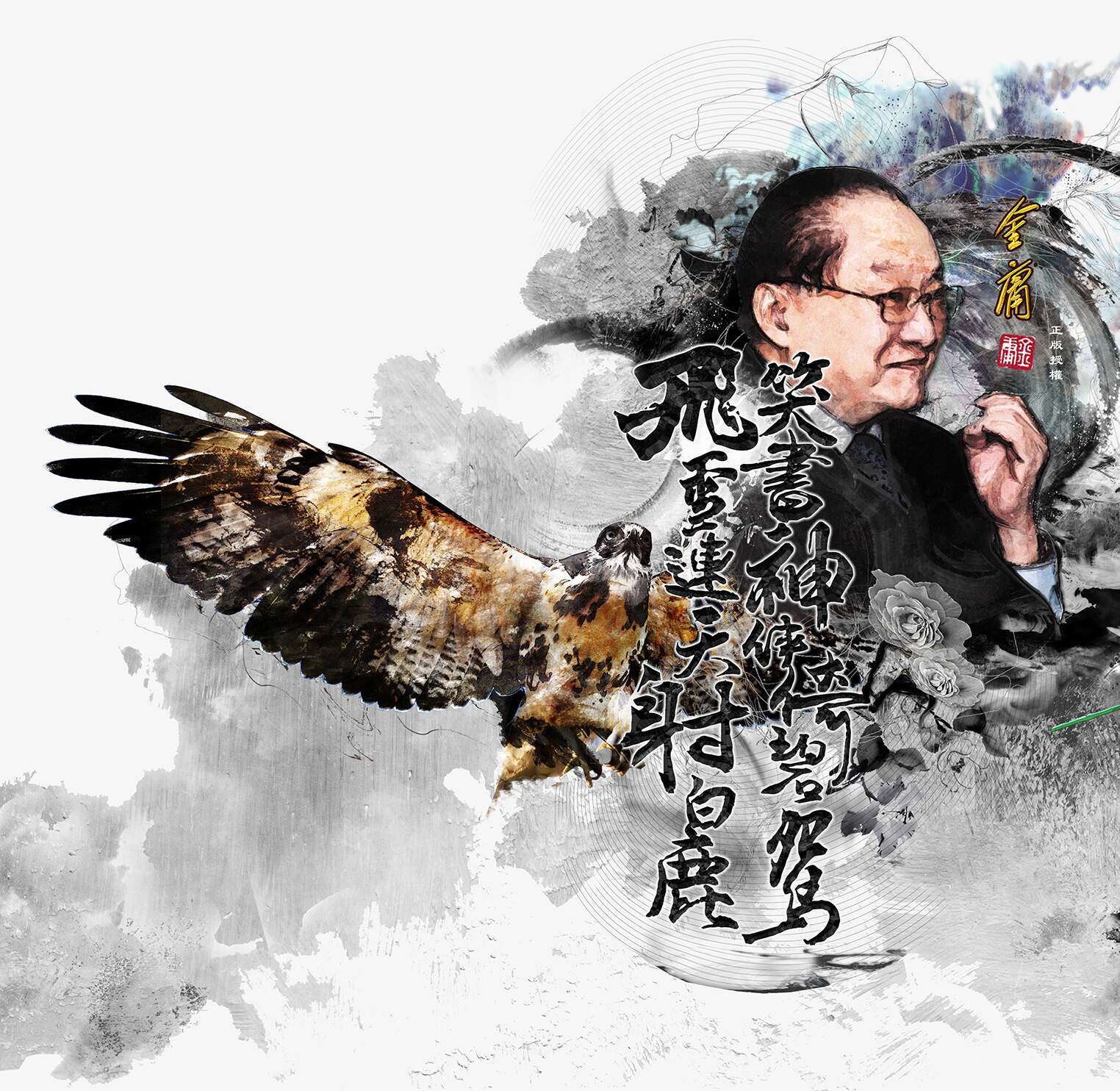
Here I have outlined the keyword "Iconic" as the basis of the design. Whole stage belongs to the elements of the Jin Yong novel.
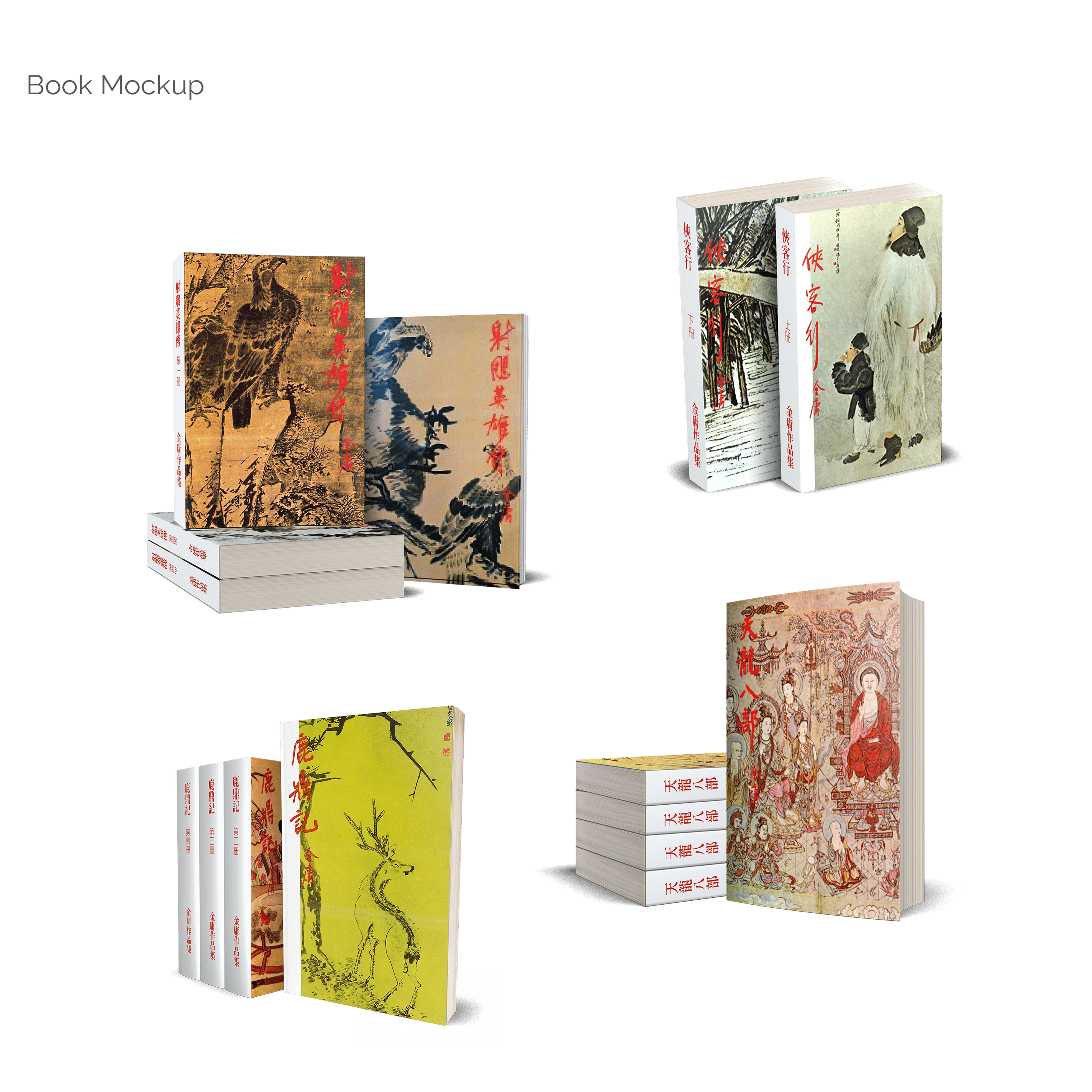
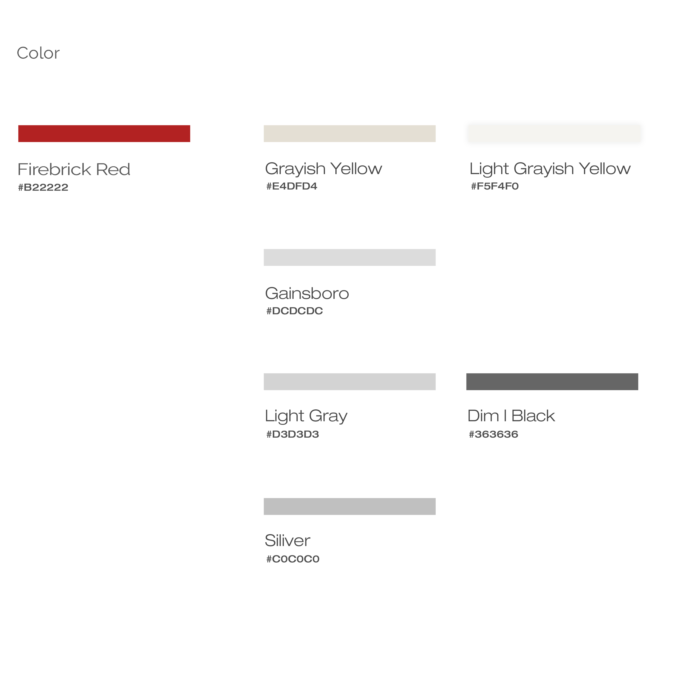
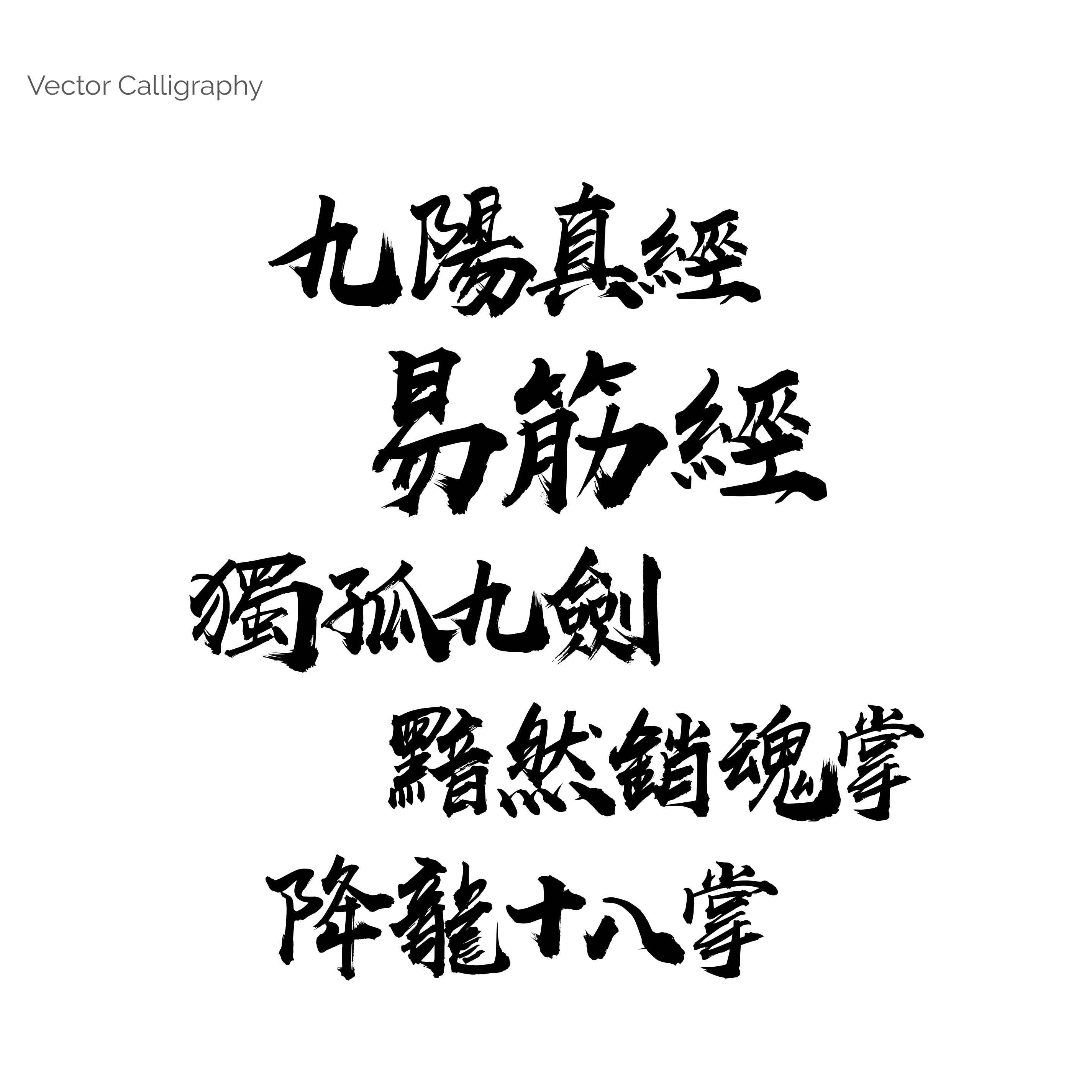
Since the pages will be filled with many book covers, it is ideal to keep the colours of the app as minimal as possible. I used light bit yellow as the background color as in the printed versions, wine red as the accent colour as Jin-Yong's seal colour. I've also customised four sets of book mockups and a unique vector calligraphy element.

Immersive Illustration
Personally, I am impressed by the infinite possibilities that Jin-Yong's novels offer. So I spent time thinking about the visuals. I decided to create something that took the idea from the novels and imbued it with my own feelings. To this end, I created illustrations of martial arts and the plot of the novels as innovative visual elements to help users feel more connected.
Implementating the Key Deliverables
Prototype
Entire design solution is that it connects directly to Jin-Yong's audience, I ran a few rounds of testing with participants, such as which best way the body of the novel is read separately from the left and right landscape screen, as well as the amount of text in each line. Several usability issue revisions are made accordingly that would result in smooth and comfort reading.
Below is the final prototype of my attempt to achieve the above goals through iteration.
Reimagine experiences of legend of martial arts literature
play_circle_filled Click on prototype to Play / Paused demo
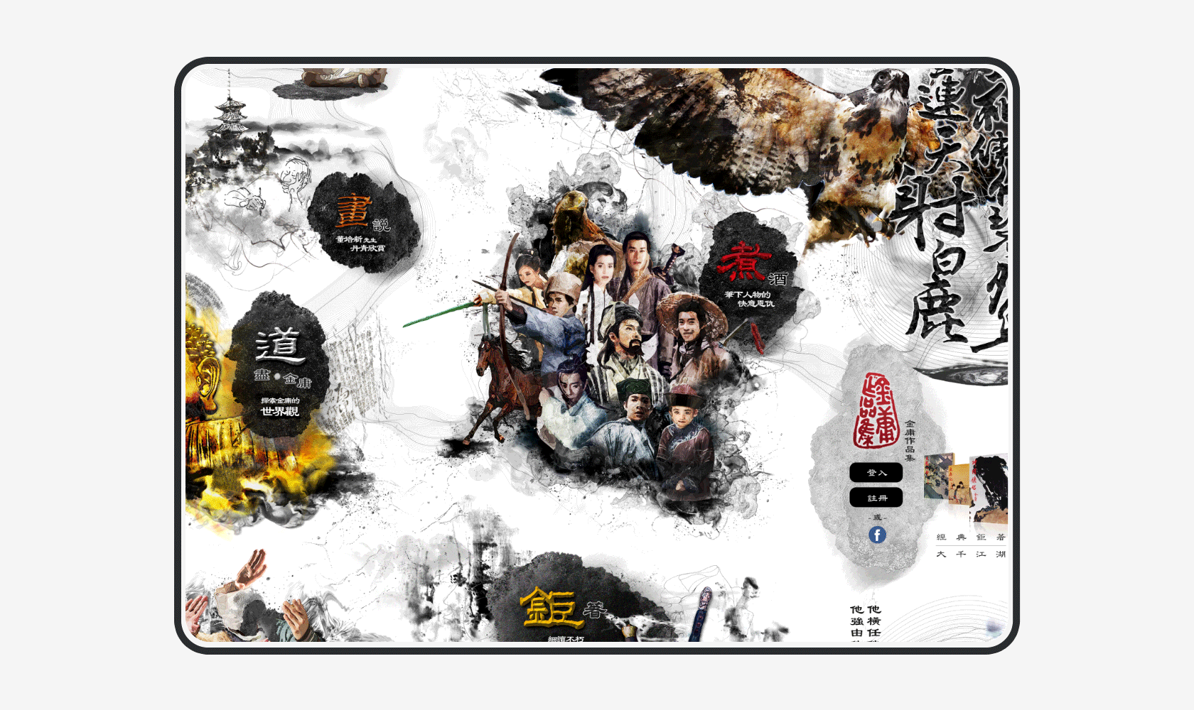
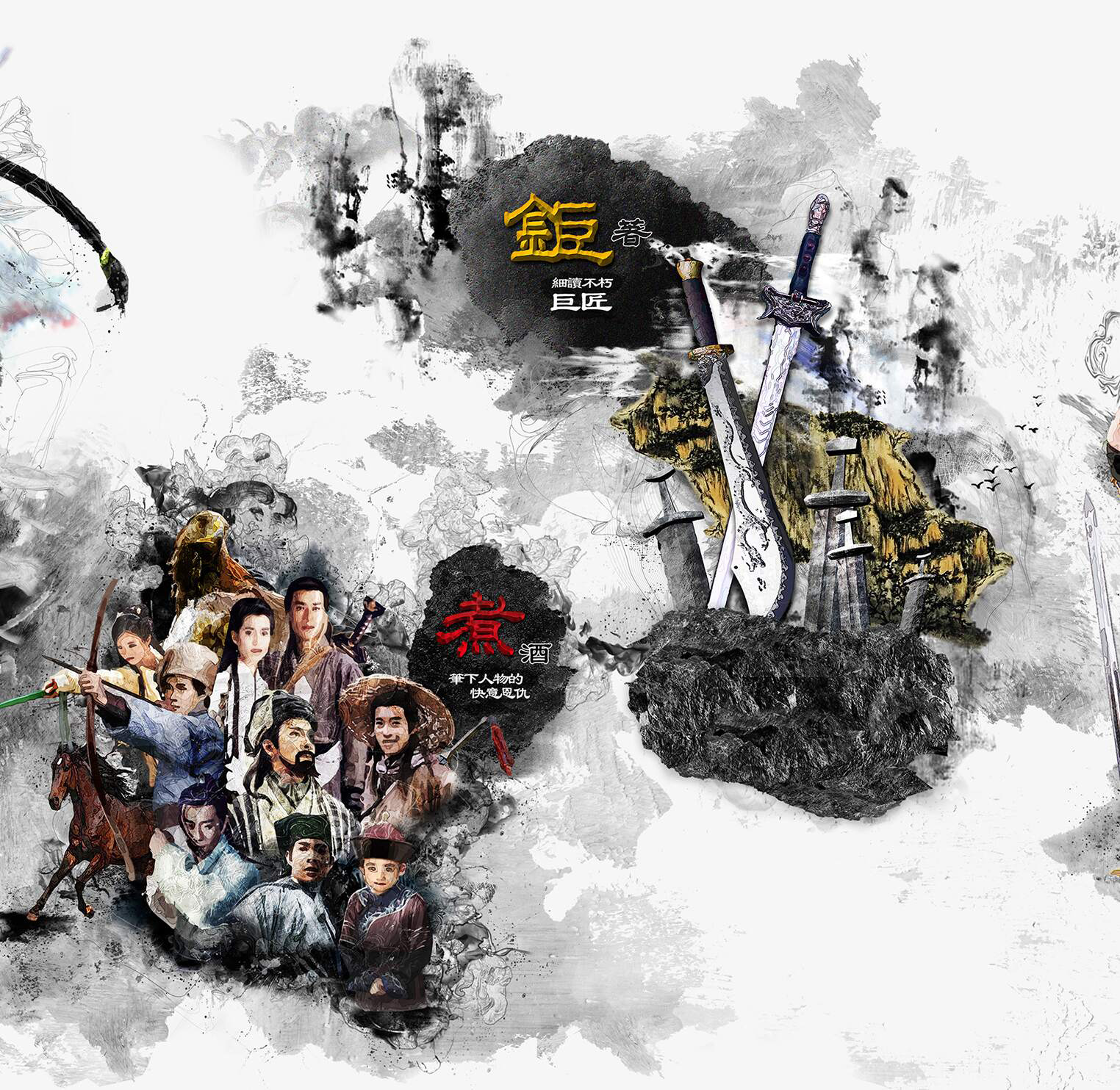
Themed bookstores are designed with infinite loop poster boards for a fresh experience as readers board. Utilising various martial arts illustration as entry to relate to each section, and for the purpose of drawing readers in through the entire navigation, which immediately evoke readers emotions.
《鉅著》 - Bookstore
《煮酒》 - Intro novels characters
《論劍》 - Martial arts info
《道盡》 - About Jin Yong's
In the Bookstore page, One of these was to attract more readers and broaden the book experience. Each genre slider with scroll through that shows more books, where divided into 3 category that shows :
《細讀巨匠》- Jin-Yong’s Novels Collections
《江湖以外》- Novels reference book
《論盡金學》- Jin Studies research book.
Enhance Novel-length Reading Experience
play_circle_filled Click on prototype to Play / Paused demo
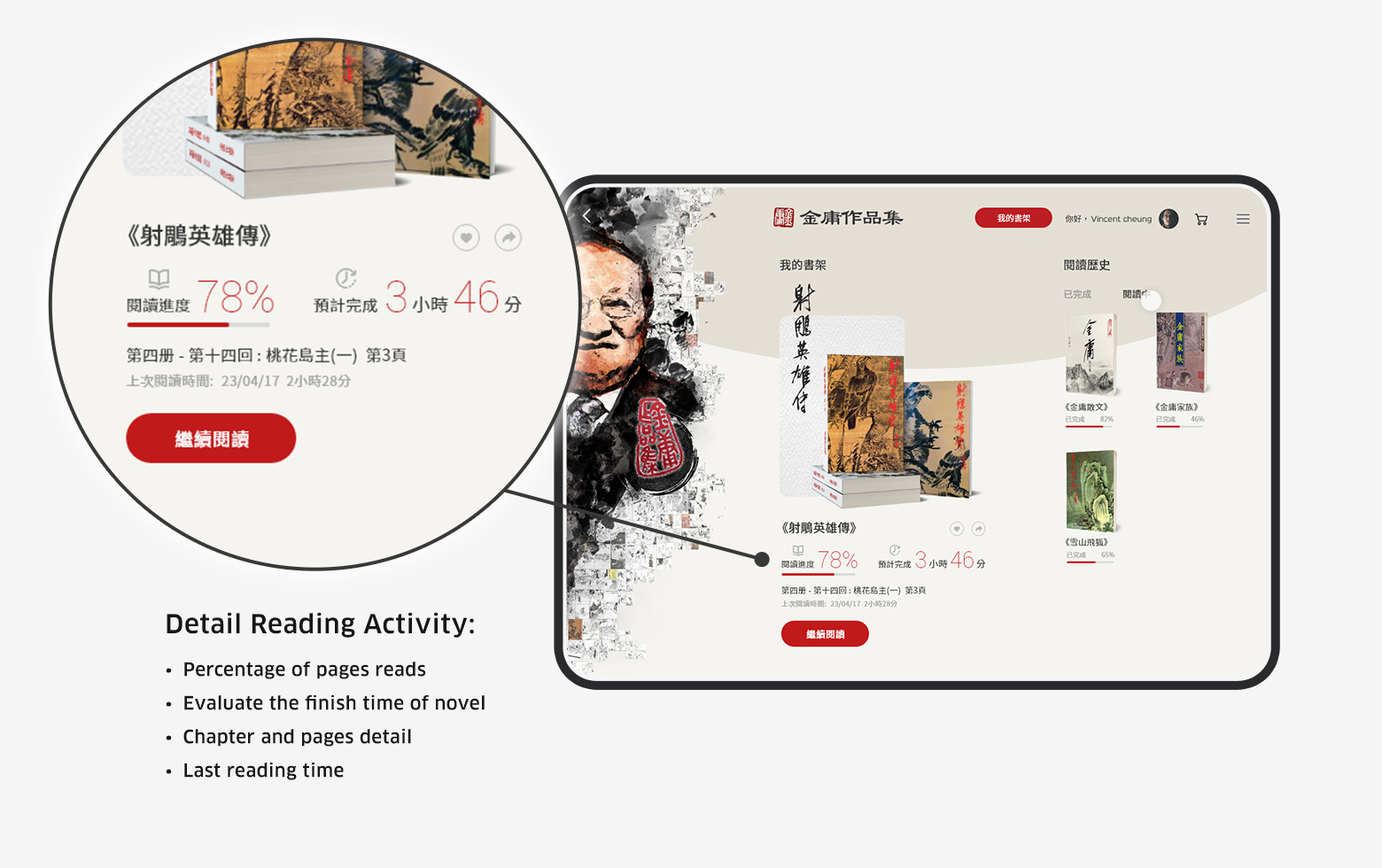
Detailed Reading Activities
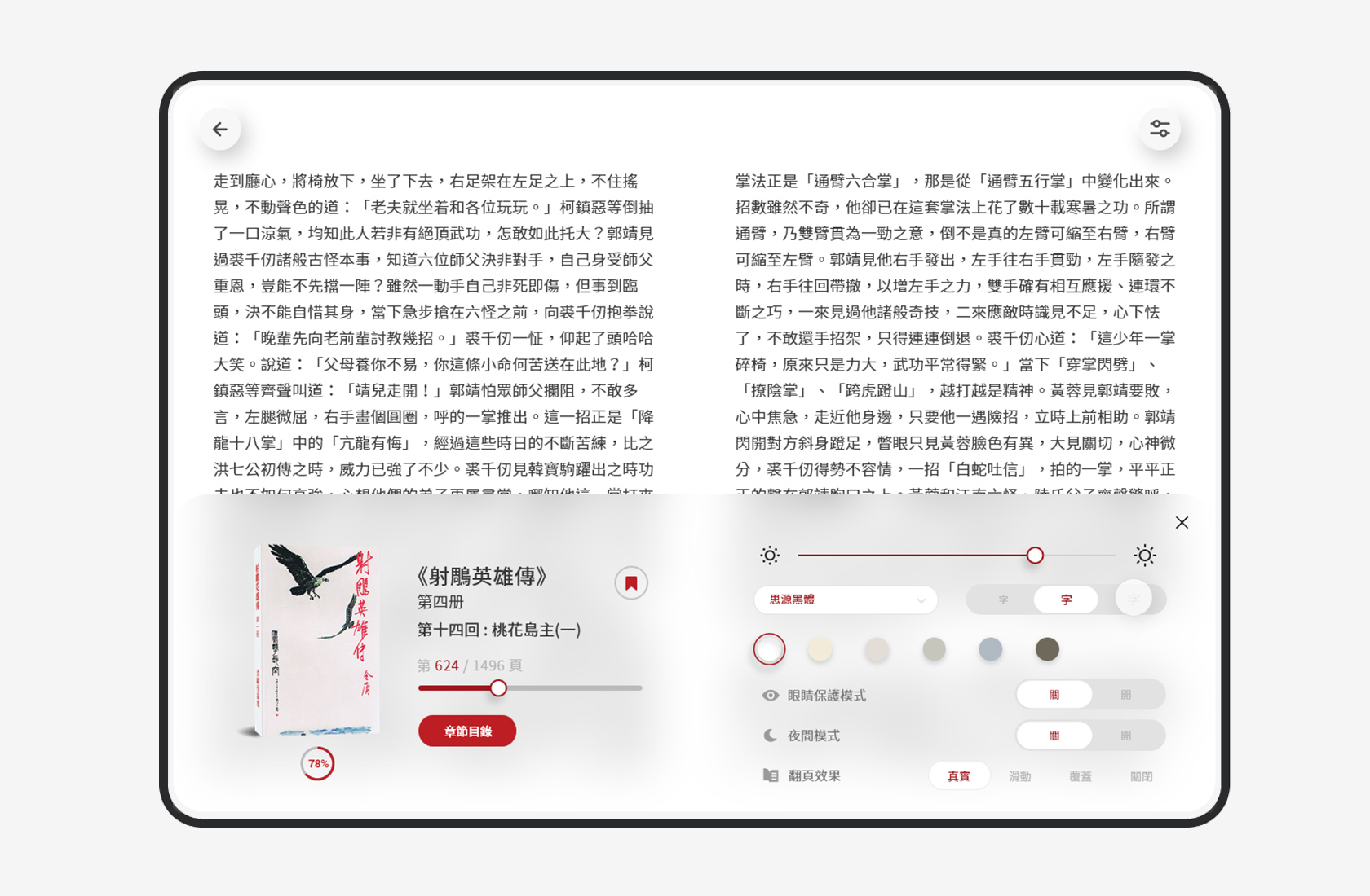
In "My Bookshelf" where shows overview of novel. With status bar in current novel section. User can keep track novel reading status that contain: Current percentage of reads, Evaluate the finish time of novel, Last reading time, and Chapter/Pages detail which clearly to given aspects of time control to users before reading, so that they were more flexible.
Reading on Tablet
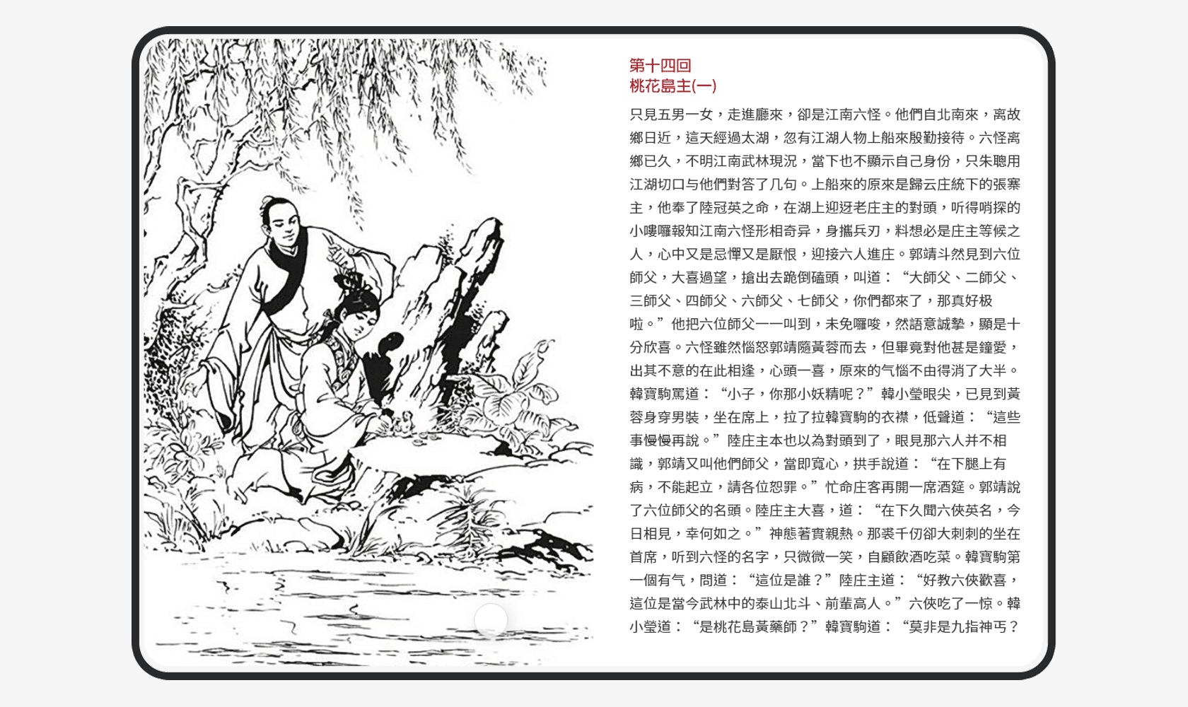
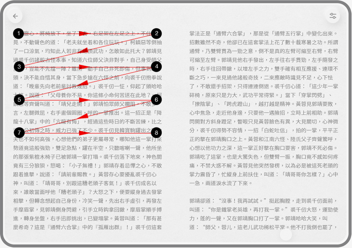
As the prototypes showed, the tablet-first approach was smooth, with the same wide screen reading as the printed version feeling more comfortable and less cramped. It did not cause much page swiping over reading. Beside, Novels illustrations between the chapter was reserved that keep reader feeling "Real" also.
Specify Color Scheme for Eye Protect
The "Eye protect mode" as new feature that help to less of a visual stimulation to the user eye. A background color value as #f4f4ec and gray font as #333, with a bit emboss paper texture same as printed version. That provides natural contrast and readability for body text.
Credit: The color scheme according to "Luz Rello - Bigham Human-Computer Interaction Institute & Carnegie Mellon University"
In-App Reader Interface Design
Final UI style with a simplified, clean palette accented with wine red of colour where it mattered most, where users could dive into novels more comfortably make it friendly for long reading.
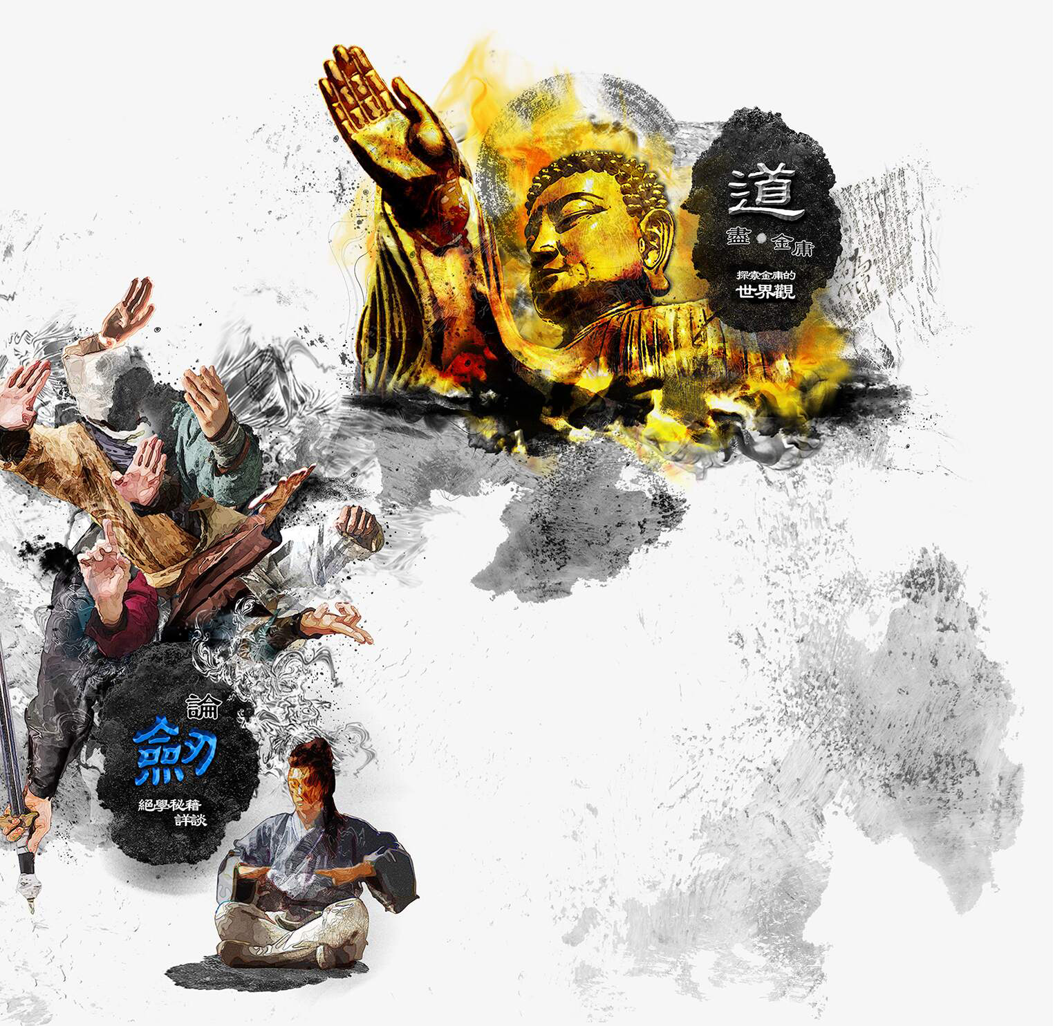
Deeply Engage for Jin-Yong's Novel Audience
play_circle_filled Click on prototype to Play / Paused demo
Value-added Content
As prototyping showed, this new section contains Jin-Yong's novels well-known characters, variety of martial arts knowledge allow users to interact with. These give the user fun experience more rewarding, so that better conveys of Jin-Yong's theme bookstore image, and learn more about the Jin-Yong's novels behind it.
Validation Outcome
Usability
Testing
I conducted with 4 participants testing the working prototype and rate on a 5-point scale ( 1: Very unsatisfied and 5: Very satisfied). Here are the feedback:
In-App feature for long-form reading
Satisfy
person person person person
Reading on Tablet Reading Platform
Neutral
person person person person
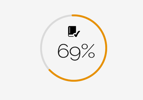
Customer Satisfaction Rate (CSAT):
62.5%
Takeaway
This project an MVP solution, I look back on the whole project was very fun, challenging. I hope Jin-Yong's Theme-bookstore will bring something different to the market. It taught me how to make decisions based on data as well as intuition. This project forced me to try a bold solution in terms of design strategy. I feel it has allowed me to push my creativity and passion for design. Believes that there should be no boundaries between users and their reading experiences.