Design Context
Overview
Due to COVID-19, there has been a shift towards everything digital and sustainability. However, this is a solo project that I takes full UX/UI, and I was inspired by an eco-news story. The aim is to eliminate people's dependence on paper business cards and a huge drain on the earth's resources which may be unnecessary.
The aim was adapt to user behaviour by optimising the overall digitization experience, whether it's a paper or the current business cards user. The high vision was "PAPERLESS" to help people be more eco-friendly; "Save Our Home". This is where the project started.
Did you know ??
"Each year around 100 Billion business cards are produced worldwide, Has over 7 million trees are cut down to print paper business cards. 58% end up in the bin, and going to landfill."
Problem
Business cards are still a business courtesy in our society, but the fact that they are not environmentally friendly. It is unlikely that business cards will be phased out any time soon.
Obviously, many people still use paper business cards. Whenever business cards are sorted, many of them end up in the trash which causes pollution.
On the other hand, the current app experience are vague and difficult which creating barriers for users. This means that users reuse paper business cards.
Design Challenge
"How might we reduce barriers for paper card users going digital in order to achieve environmental goals?"
""How might we design a stress-free experience to well-organize business cards more efficiency in their daily work??""
Solution
Aim for easy-to-digest task flows that guide users to take action more easily to reduce the cognitive load and stress on both types of users. Minimize their frustration with business card digitization and management while increasing motivation to use the app on a daily basis.
Research and Discovery
Desk Research Finding
77%
individuals users and 63% of small business owners haven’t used a digital business card app before.
57%
Believe that business cards are good for their business, but physical cards can get costly.
12%+
Not added business card contact into mobile results in over 80% of physical business cards are lost, damaged, or forgotten within a week.
70%
Print rate of business cards decreased due to COVID-19, because they don't need the service now.
Knowing the Business card users facing
The first things was to understand the users through data. To better understand the target users what I'm trying to solve. I surveyed 10 participants via a Google Form about how they manage and collect business cards on a daily basis.
The following questions to learn about their current user facing :
Each with their problem and the way of use. Here are the summarized 2 type user quotes :
Paper card user :
"I always left in my suits pocket when i got them. I haven't time save it, end up take time to find it on my cardcase, desk or somewhere"
I don't deal with that many business cards on a regular basis , put it into my cardcase when I go back to the office
"If i moved office or changed something, I often re-print business card. I can not inform them immediately if I had new card."
"I often import contact info to my WhatsApp or address book."
Experience in app :
"The app is helpful but difficult to operate, it takes about 2-3 minutes to add cards when I get back to the office. Sometimes I will import directly into Whatsapp".
tips_and_updatesInsights :
The biggest issue I discovered was around motivation to manage thier business card, or lack time spend on. As a habit goes on, motivation would decline with little to no means of raising it up again.
Usability of Existing App
Where I focus :
What features those app provide on?
How they interact the App with users?
What a gap or position those app?
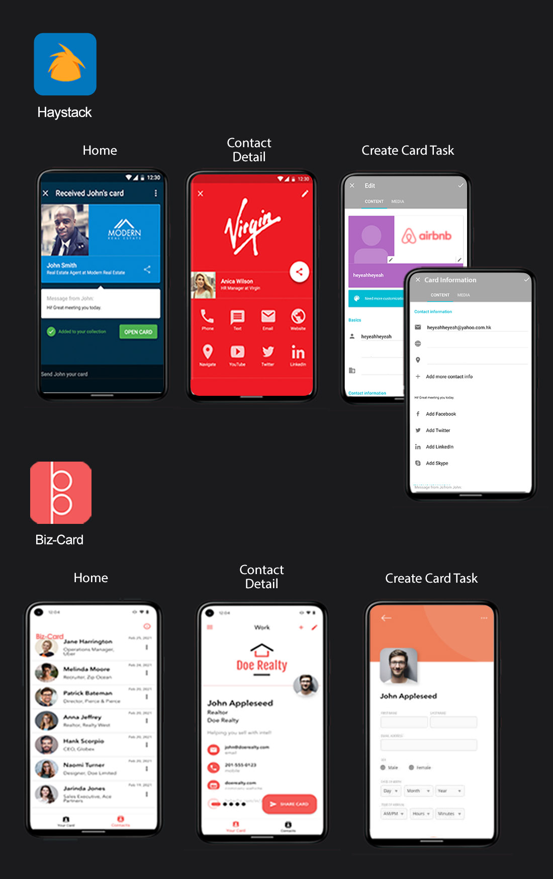
Its core functionality is card creating and exchanging cards. I've tested two app how interact with task, operate and design. Here is finding :
donePROS :
— Contacts are presented in profile page as a way that are easy to access and clear
— With sharpened content hierarchy
closeCONS :
— I went through Haystack and Biz-Card for the card creation step, it take a minimum of 2 min which I feel quite fuzzy and stuck step. For example input field or form without hints, over describe text
— UI inconsistency and core function CTA button wasn't prime location at home screen; some placed in the hamburger menu
Identifying the Right Problem
Narrowing down the problem
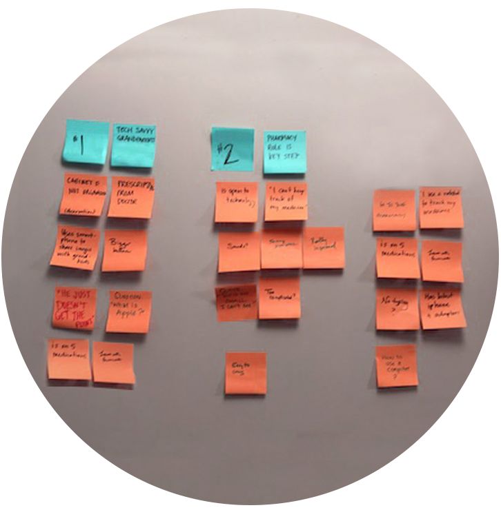
I tried to analyze what is problem they are facing actually, that helped me make inferences and observe it clearly which area to improve for. Here, I summarize user quote that narrowing down scope what are the key takeaway through card sorting.
running_with_errors
Lack of time
and conscious to organize
Takeaway :
Across those feedback gathered, With 9/10
participants said who still using bussiness paper card. There are common issue of both types users; Sometimes
they don't take the time to dispose of their business cards after collecting them. As a result, they can easily
forget, lose or wash them.
sentiment_dissatisfied
Unsmoothly card creation process
Takeaway :
1/10 of the participants had only
experienced the app. They got stuck while interacting with the process. This reflects their lack of motivation
to use the app, as well as its popularity.
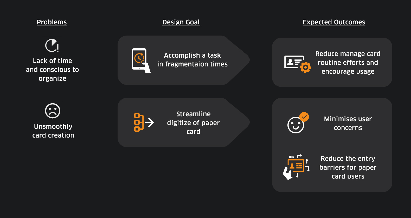
Insights
tips_and_updatesCard organize habit
The truth is that most people would not immediately organise the card in the card case or manually save the card information on their mobile phone. They feel hassle on finding card when they contact with someone. Besides, Due to long time run a business and store sizable stash of business cards. So they end up wasting much time to organise them.
tips_and_updatesUnfriendly task flow
Card creation step take a time gap to understand about it, and need some patience to get task done, that cause paper card users create barriers and feels frustrated. While reflect current user unable to get motivate to use it also. That means the user might revert to using paper card if it doesn't meet scenario and situation. Users focus on how helpful in real life will be interested in using app.
tips_and_updatesIssue of pollution from our lives
In fact, There was a human-facing issue not only app usage or not so. A lot of card ending up in the trash whenever organzie thier business card. The paper card user can not make a business card instantly if information changed. Has a cost issue to order an entirely new stack of business cards also. There's also extra pollution whenever the people reprint or lose the card. In other words, the paper card user is actually Target Group than the current app user to achieving environmental goals.
Defining the Design Framework
Identify the User Goal
Integrated research and insights to cover both types of users to envision what kind of problems such users will encounter, what motivates them, and what they are doing.
"As a Paper card user who often handle stacks of business cards, needs straightforward process without any skill and concerns whenever using the app, Because take much time to manage and evaluate each one and purge they don’t really need. It's really hassle work."
"As a Digital card app user who often face to face with client, wants to be simple way while interacting with the app, Because they want to avoid complex operate and daily manage efforts. This helps maximise the use of my time, which is important."
tips_and_updatesTakeaway :
Both types user was reflected a common goal. Should need as little time and effort as possible to interact with the digital card app during busy at work, so that maintaining a business card on a daily basis is not a extra work and feels hassle.
Here are design opportunity was decided to be implemented. Based on this, the solution can be further explored through an explicit framework :
Adopting Hypothesis to driven Design Solutions
“We believe that creating a digestible process for handling your own cards will reduce management effort and more engage paper-based users go digital as well. [Solution ]
Will achieve a lower to 2 min time-on-task of the core task. [Success metrics ]
In addition, Although they have been using paper cards for a long time, but aware of the environmental impact of paper, they believes that using the digital card app is good for both daily work and the ecosystem." [Impact ]
**** This success metrics based on previously of user research and competitors testing.
Ideating the Design Strategy
Proposed Solution
Streamline step-oriented make tasks run smoothly
In my proposal, I honed on streamline the task flow so that users won't have to face any additional steps such as manual import and card appearance design which were previously seen as barriers and stuck.
Beside, enhance step flow visually to guide that helps reduce users cognitive load and frustrations. It also helps to heighten the motivation of both user types. I suggested these 3 actionable solutions :
developer_mode
Simpify creation for digital card
Create a flow intergated OCR feature that able to capture paper card data by camera shot its as a digital card appearance also. That able to skip manually input and design card step- ideal for those who are paper card users, and who are unaware of design.
phonelink_ring
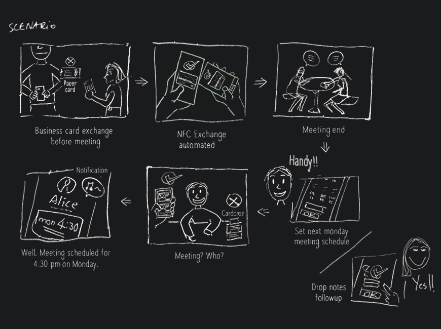
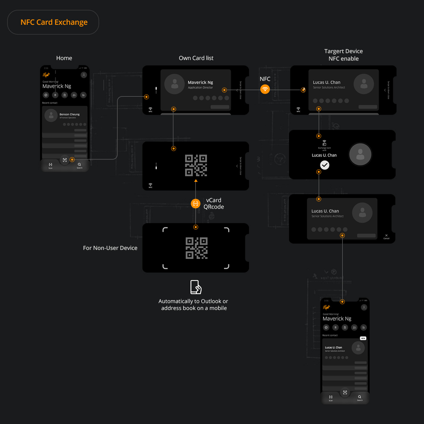
Improve usability through NFC exchange processes
Automated process with NFC data exchange makes it easier for users to organise their cards in one place after an exchange. With push requests when the other side changes their card information to avoid manual updates.
Create schedule and reminder features that eliminate the need for users to use other applications to make schedules. This encourages users to use the app more frequently each day.
I placing the target group who are newly turn into digital card app in scenario. This purpose of considering NFC exchange to happen at the meeting, and how helpful in thier daily routine.
contacts
Digital cardcase approach for easier interaction
A home screen similar to a cardcase gives them immersion rather than just a contact list. Make the interactions the same as the paper cardcase to ensures real-life usage and behaviour. Plus, using biometric fingerprint sign-in is perfect for exchanging cards prior to a meeting.
User Flow
The previous user flow had quite a few fuzzy and stuck steps to get through. Such as after create could contact person info, they had to design card visual part. This flow wasn't really helpful for people in fragmented time who needed complete quickly there's room to simplify the process.
ads_click Key considerations
Do users think that the user flow digestible, complete thier task within 2 min??
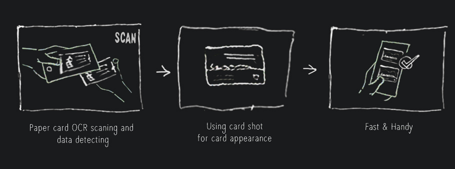
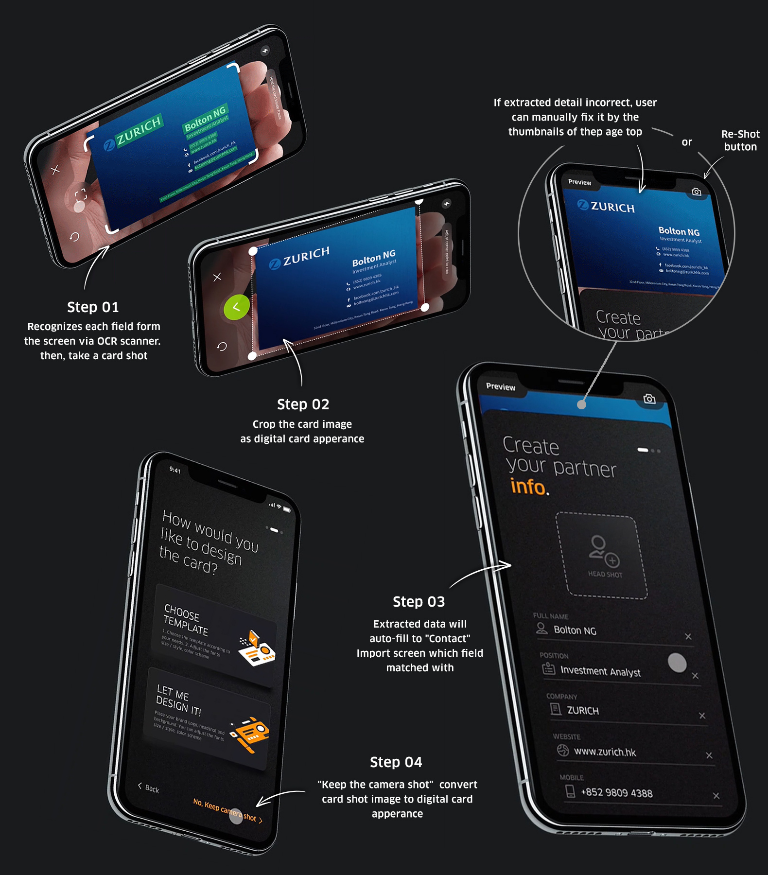
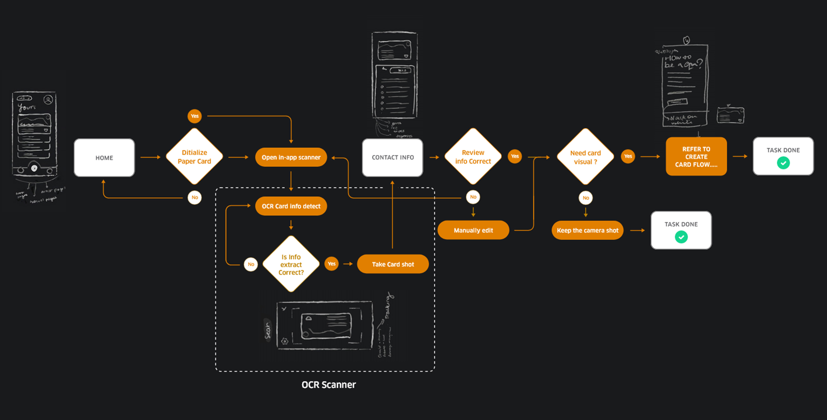
Digitalize Paper Card
The newly proposed card digitalize process is all about avoid importing information to speed up their work flow or where users get stuck, so that the app can be quickly operated by simply moving a finger on one hand with OCR scanner feature.
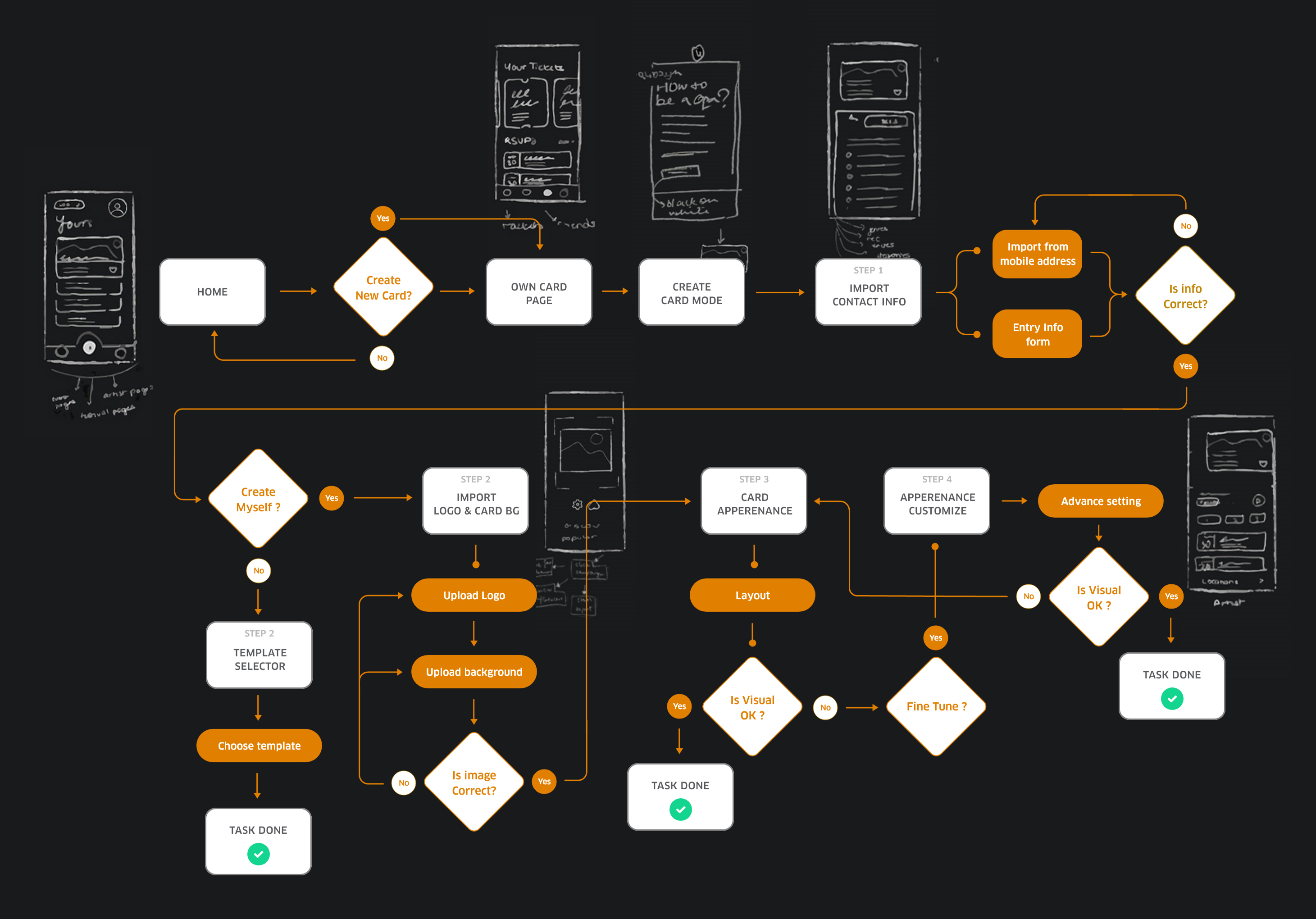
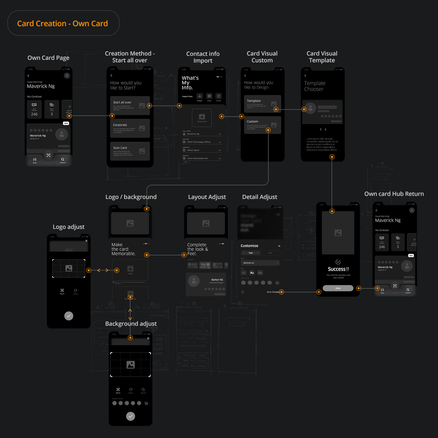
Create Own Card
In the new flow of creating my own cards, I did away with all the vague parts that didn't directly contribute to the task flow objective as much as possible. Such as an unnecessary description that is replaced with an icon, , and the each screen of the flow more visual element.
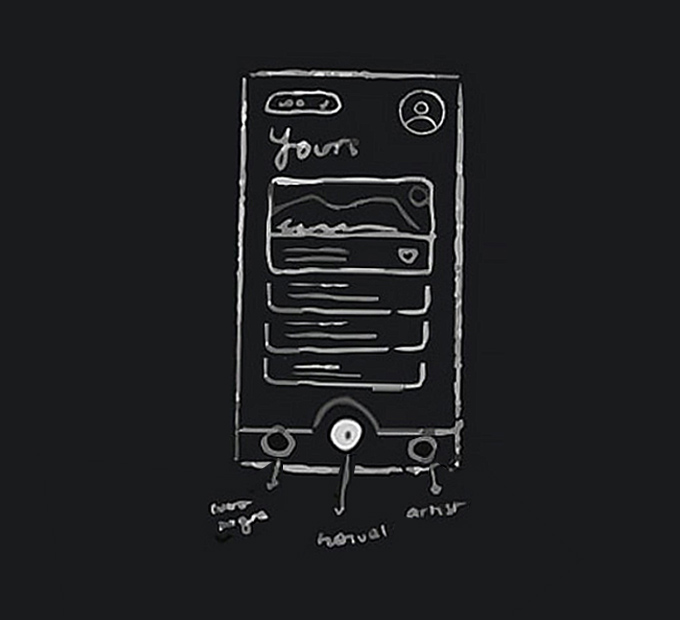
Hi-Fi Wireframe
Next, Walk through how I designed the rest of the experience. and make idea of how the app actually look and feel. Below are the core features wireframing in which run few round A/B testing:
Establishing the Design Language
Visual Communication
The 'Card' is the key visual element throughout the app. Keeping physical card layout design could be understand and legible rather than pure contact list. Utilize dark scheme makes the digital cards professsional calm appearance. In the typography, ClanOT family to be sure that more readable, white as primary for the text body, variety of gray as secondary, and legible with orange accent color.
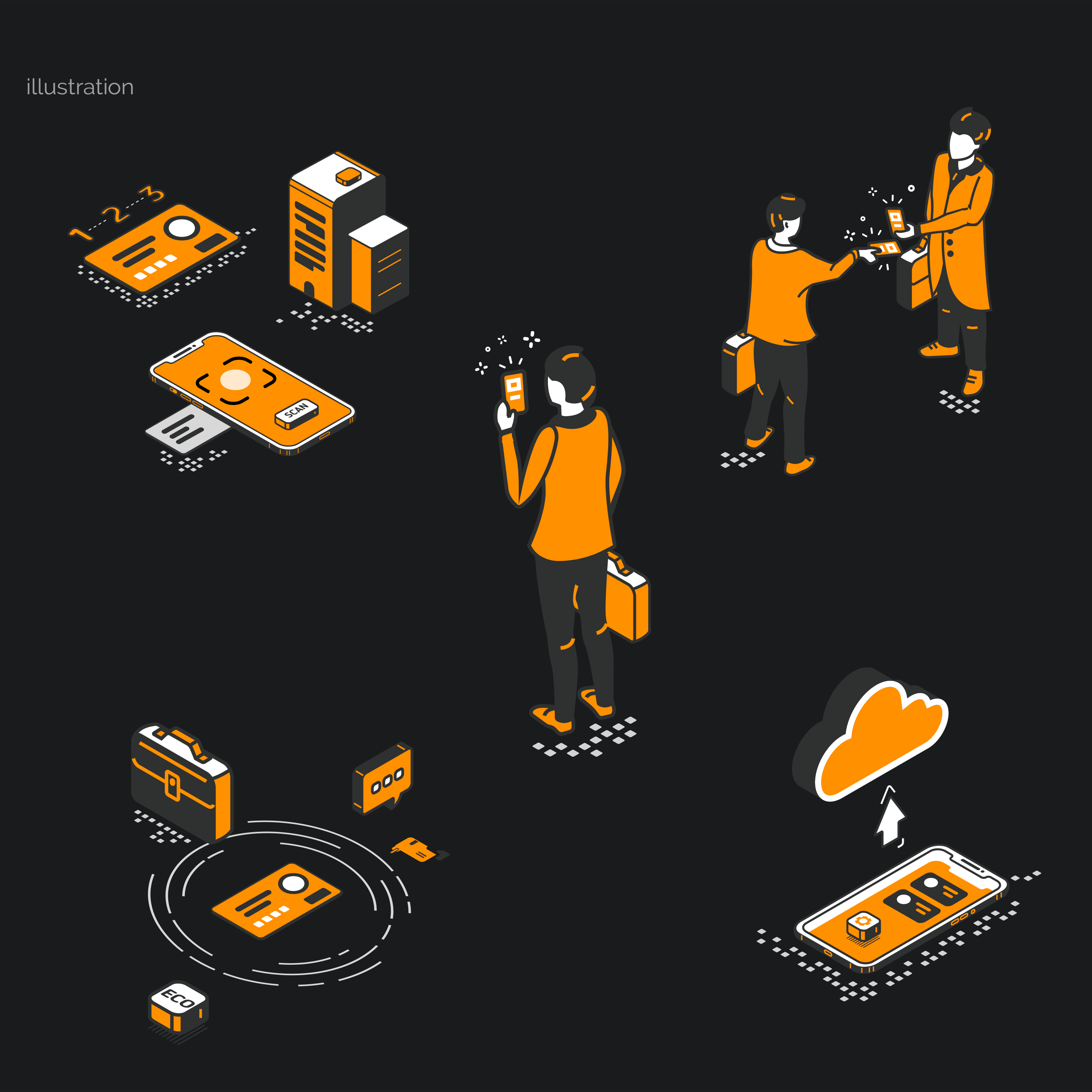
I utilized huge set of icon can help users operate easier and faster as compared with text describe, and avoid causing confuse between users and the UI. Plus, I created set of illustration element that conveyed message clearly while user interacting key screens and intial onboarding.
Iterating the Design
Room for Improve Usability
In this phase, I focused on interaction that improve task completion rate. With 2 participants testing how they interacting with the flow so that most closely to the user expectations based on those feedback.
ads_click Key considerations
Do users feel negative emotions or get stuck in the flow while completing the task?
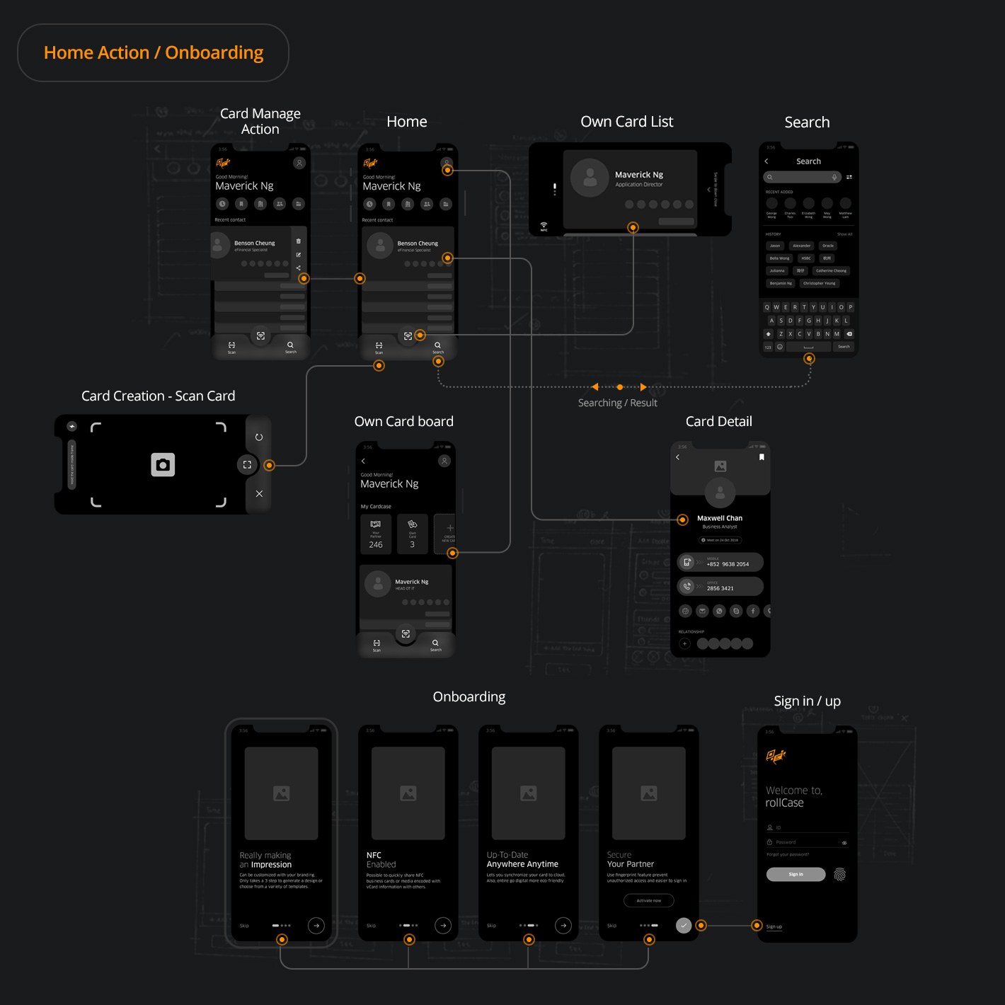
Home Interaction
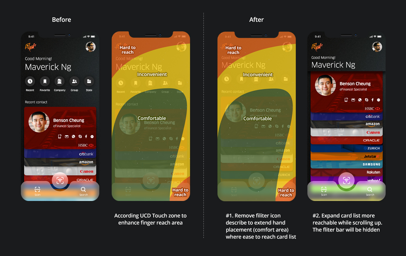
Iterating :
They expressed "It's quite easy to use and
understand". But I noticed that the finger does not fit when you tap on the card list. I tried to remove describe
text of icon in mid filter bar shown icon symbol only and put the card list a bit upward. Also, In order to card
list more reachable while scrolling up. The fliter bar will be hidden.
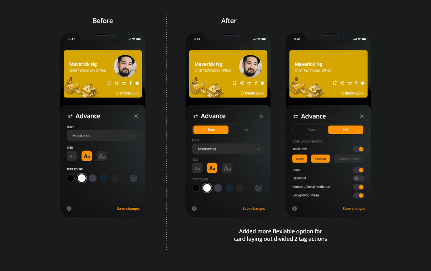
Own card creation
Iterating :
I added more flexible option for card layout
divided 2 tag actions they wish. such as font size, and what info display on etc. Also, despite 2 participants who
completed the task within 2 min, but they felt the step a bit not smoothed. So I fix some interaction element
issues.
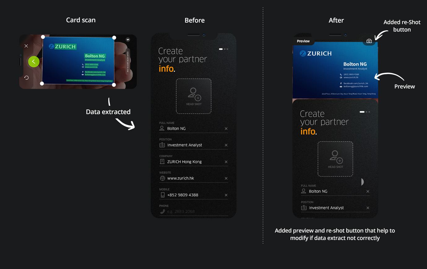
Extract paper card data
Feedback :
After card scanned, They were unsure correct data
of the card shot was filled if unextracted data. From here, I added preview and re-shoting button of the screen
accordingly that help them for editing if data extract not correctly.
Implementating the Interactive Flow
Prototypes
This app lies in its convenience and actionable it directly affects the use of the product experiences. During the few rounds iterating driven by revision and A/B testing to figure out which is effective with users. Final prototype is more straightforward would be boost the overall users experience.
Keep business cards organized and at your fingertips!
See how its work
in action.
Home Interaction
play_circle_filled Click on prototype to Play / Paused demo
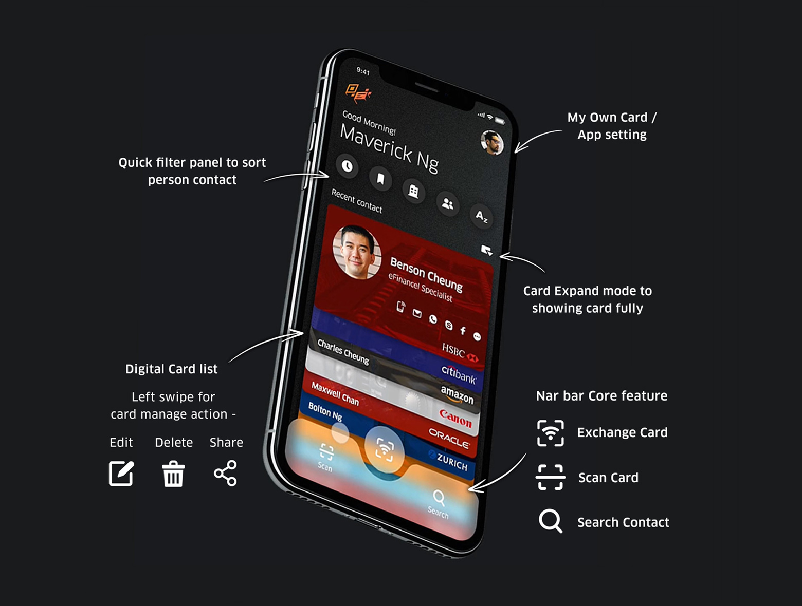
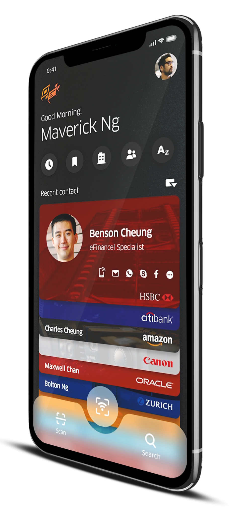
The Home screen designed like as cardcase shows current card status where easily to access and perform the manage works. Feels "Finding" motion like physical cardcase when scrolling the card. Plus, core feature button in obvious location at the bottom that enable perform the task quickly.
By default, the recent contact card is top of list. Tapping on the middle filter panel allows a user to sort out contact person quickly, such as recent contact, favorites, company and A-Z sort order. By left swiping card, it will open a side sheet that manage action lets user edit, delete and share.
Tapping on "Card Expand" button to open the digital card fully that enable to users make the call rapidly with one tap.
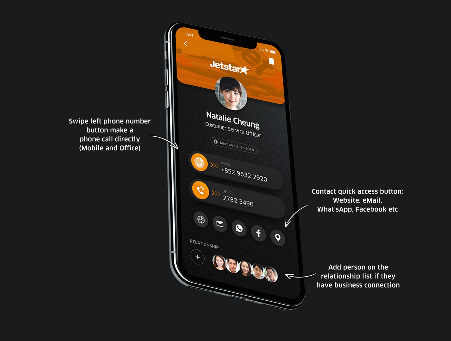
Digital Card Detail
In "Card Detail" screen, Swiping left the phone button (Mobile or Office) make a call directly. With a various contact access button based on what the user was imported: Website. eMail, What'sApp, Facebook etc. Plus, Allow user to add person of contact in the relationship list in which easily maintain with their personal network each other if they have a business connection.
play_circle_filled Click on prototype to Play / Paused demo
Contact Card Search
In Search screen, shows logging searches, recent contact person and history searches tag. Tap on mid filters bar help users narrow down their results with predefined categories. Make it easier to reach out to find person they contact for.
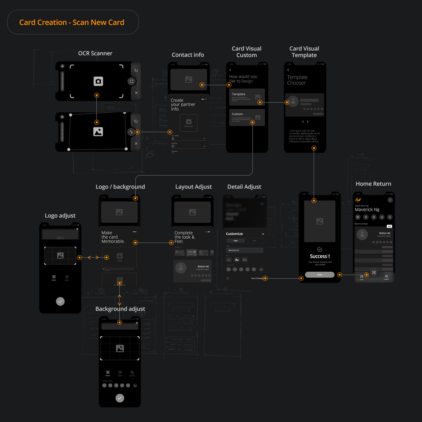
Paper Card Digitalize
play_circle_filled Click on prototype to Play / Paused demo
As the prototype shows, the digitisation process was almost automatically not required input or design skill. These are extremely useful for people who have large numbers of paper card going to digital. Without frustrating them with too much work flow and high entry barriers so that more engaged paper users with.
swipe_up How it works
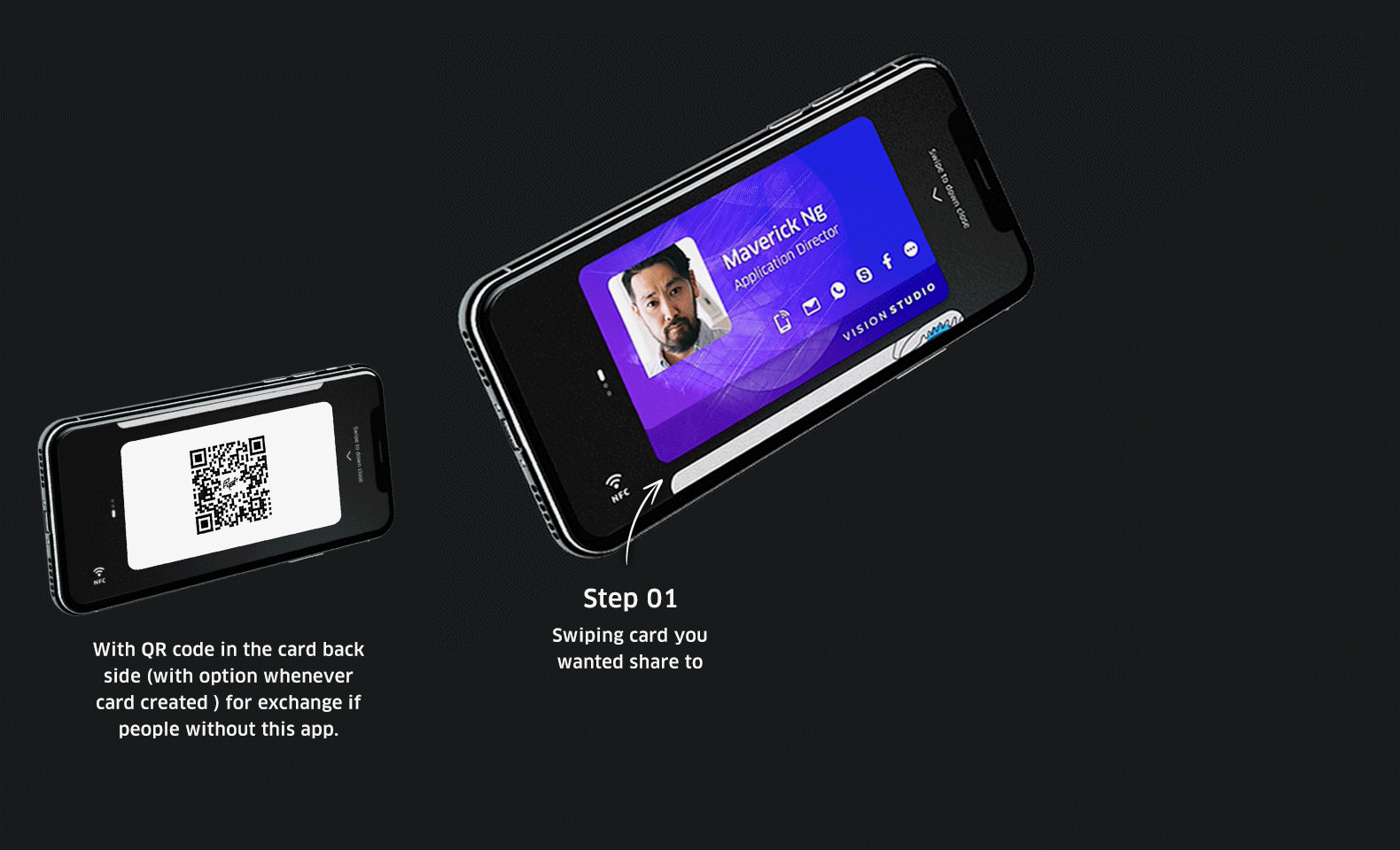
Digital Card Exchange
play_circle_filled Click on prototype to Play / Paused demo
As the prototypes showed, The animate exchange process with NFC feature was almost instanly. Then, users able to create the working schedules and reminders for the future things in which follow-up more easily after meeting.
swipe_up How it works
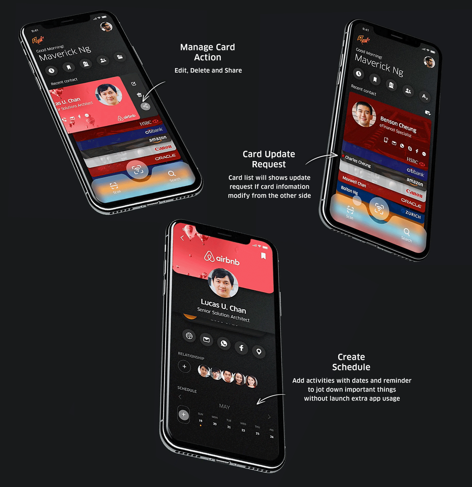
Digital Card Manage
Card Action and Share
By left swiping the card, gives options to edit, delete. It also comes with card sharing via recent contact, email, WhatsApp, Facbook and Skype etc.
Card Info Update Request
Card list will shows update request if card information is changed from the other side.
Schedule Creation
Within "Card Detail" screen, one has the ability to add schedule activities with dates and reminder feature to follow up or jot down important things after card exhange without launching extra app usage.
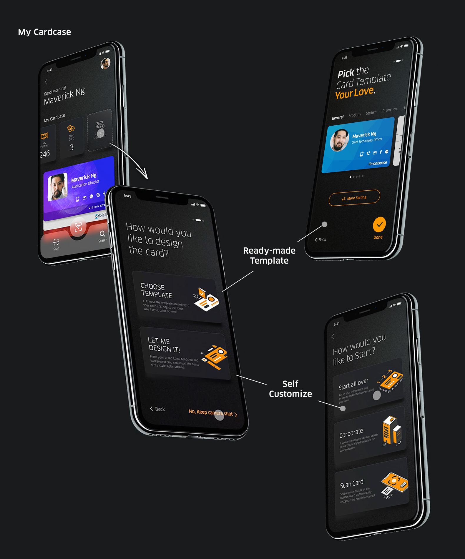
Own Card Creation
play_circle_filled Click on prototype to Play / Paused demo
One of design goal was to make completion task intuitive. Card creation process provides more visual element that how to perform smoothly to reduce users time-on-task. With friendly headline in each step in which eliminates stress with user who feels “Order to do to so” such as "What's my info" rather than "Import contact info".
swipe_up How it works
Card Creation Option
Ready-made Template :
Auto generated based on whatever the user has imported that help to streamline the entire process
Self Customize :
Create card element and layout themselves, such as logo, background, and color etc by editing tools bundled. The create own card process where 3 mode available to:
Start all over - Step-by-step card creation
Corporate - Access from Cloud template
Scan card - Paper card data extraction by OCR scanner (same as paper card digitalize process)
Start all over
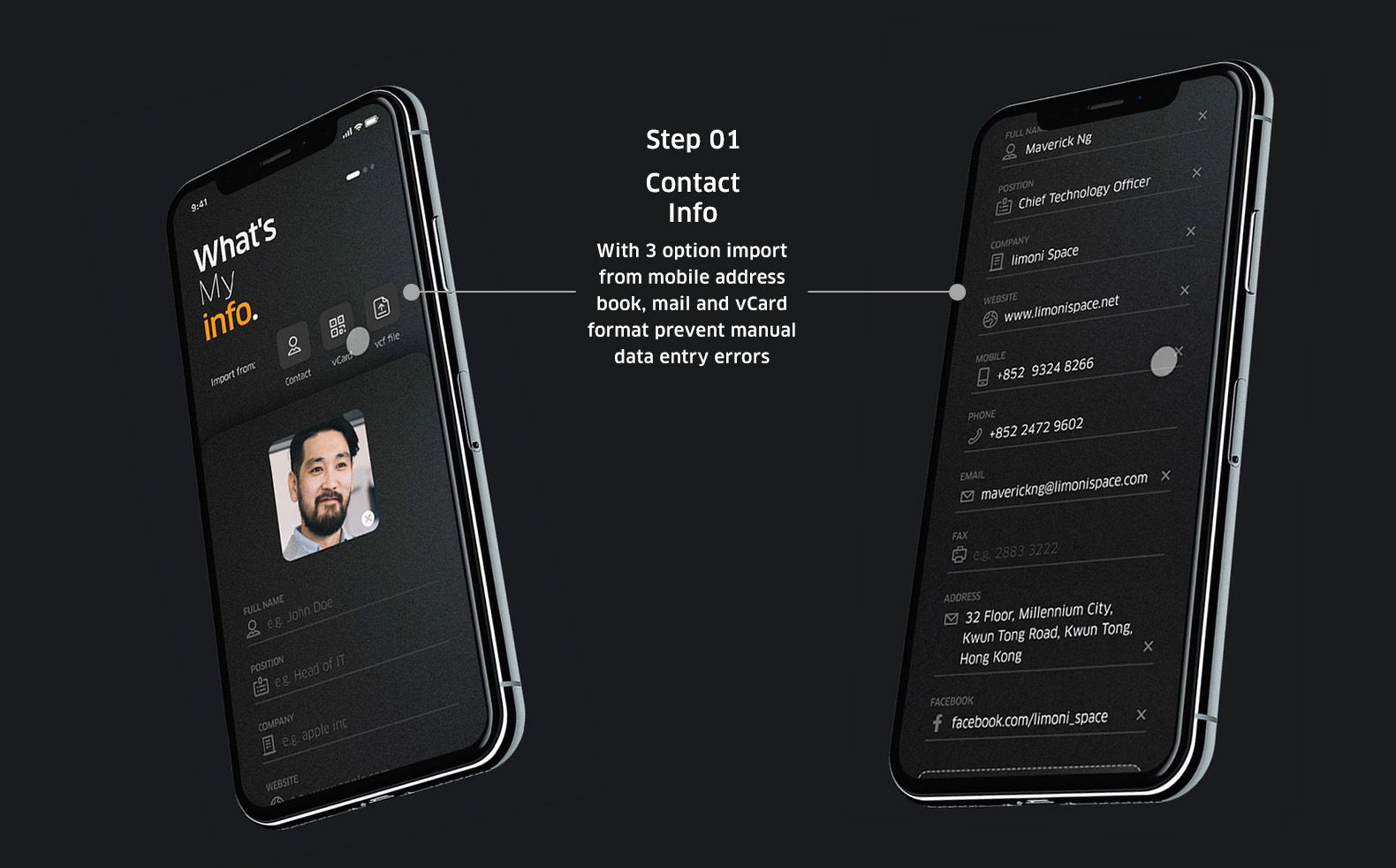
Step 01 - Import Contact Info
Via address book, mail and vCard format synchronize through thier phone so that prevent manual import errors. The head icon is optional add or not if needed.
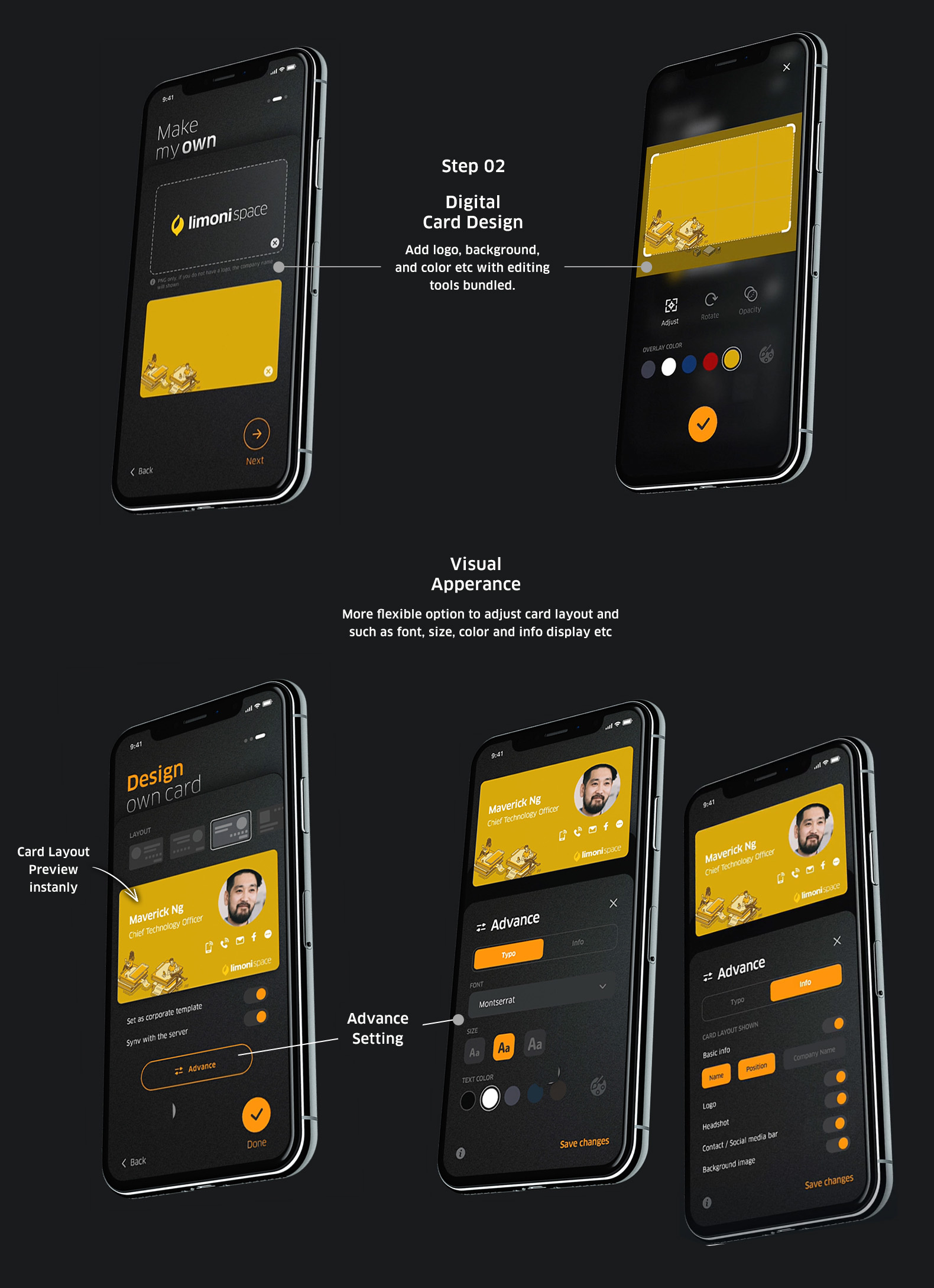
Step 02 - Card Visual Apperance
Add logo, background, and color with editing tools bundled. Also, allow users adjust the card details what info displaying on, such as layout, font style etc. Within as the user adjust their digital card, the layout will be change in preview instanly.
Feature
Enable update request to recipient
Send update request to recipients devices if user adjust card information.
Set as corporate template
Created which cloud storage where share with workmate or teams. Reuse card template design to standardize with thier brand guideline to avoid duplicating efforts
Onboarding
play_circle_filled Click on prototype to Play / Paused demo
Onboarding as the app's first handshake with a user. The user will see what task the app can help them accomplish, increasing the attention and level of trust in it as well. For information security, the fingerprint login are not only easier but quick as well. This also makes exchanging business cards before a meeting faster.
Outcome Validation
Usability Testing
Feedback revealed results in terms of reducing decision times and task completion rates. Here are the impacts after testing from 4 participants:
Ability to accomplish 3 core task lower than 2 min of each
person person person person
Feedback :
"It's concise to making card process."
"I'm a bit hesitant in the scan card operate step"
Did you had the opportunity to go digital with this app if you're a paper business card user?
Agree
person person person person
Takeaway
Being the limited resources as only UX/UI designer on the project. This app is special to me because it was first own UX project. Although there are not involved business goals, which opened my eyes to the possibilities of using UX mindset as a solution. Figuring out messy things and purpose a huge part before jumping into the design, and in the real world there are many more things to consider and validate that i believe. I truly believe that design process is non-linear and non-smoothly its a cycle never really ends.
For further improvement, I tried to expand feature to the platforms: 1. Contact profile with video background of the digital card, 2. Allow share company brochure and intro video that would be a clear future stage.
Finally, I hope this product will fulfill its social responsibility with an eco-friendly - Save the Earth! :)